More game projects更多游戏项目View all projects ↗查看全部项目 ↗
Building a Scalable Campaign Design Engine打造一台可扩展的活动视觉引擎
I led the visual design of a high-volume live-operations campaign system for a global social poker platform. The work covered 53 campaign posters, seven languages and multiple in-app and social placements. The design challenge was not simply to create varied artwork. It was to build a repeatable framework that could support radically different art directions while preserving brand recognition, compliance requirements and production efficiency across markets.负责全球社交扑克平台高频 LiveOps 活动视觉系统的整体设计,覆盖 53 张活动海报、7 种语言,以及应用内与社交媒体等多个投放场景。项目重点并不只是制作风格多样的海报,而是建立一套可重复使用的设计框架,使不同市场能够拥有差异化视觉,同时保持品牌识别、合规要求与高效生产流程的一致性。
Each campaign was developed as a coordinated placement kit rather than a single poster. One key visual had to scale into a wide lobby banner, a tall in-app event page and a square social post without losing hierarchy or visual impact.每个活动都按照完整投放套件进行设计,而不是只制作一张单独海报。同一套主视觉需要适配大厅横幅、应用内竖版活动页及社交媒体方形图片,同时保持清晰的信息层级与视觉冲击力。
To make this work, I established flexible composition zones for titles, rewards, calls to action, legal information and focal imagery. This reduced redesign time while keeping every format intentional rather than mechanically cropped.为此,我建立了可灵活调整的构图区域,分别承载标题、奖励、行动按钮、合规信息及核心画面,从而减少重复设计时间,并避免不同尺寸只是简单裁切。
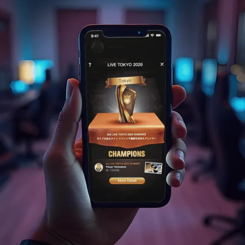
The campaign calendar required strong local relevance. Mongolia, Japan, Brazil, Thailand and European markets each received visual directions aligned with local language, seasonal culture and audience preference.活动日历需要兼顾不同市场的文化与审美。蒙古、日本、巴西、泰国及欧洲市场分别采用适合当地语言、季节文化及用户偏好的视觉方向。
Regional variety was built on top of a fixed brand structure: consistent logo placement, promotional hierarchy, CTA treatment, footer rules and asset specifications. This balance allowed each market to feel locally designed without fragmenting the master brand.区域差异建立在统一品牌结构之上,包括固定的 Logo 位置、促销信息层级、行动按钮规范、页脚规则及资产标准。这样既保证本地化表达,也避免品牌形象被不同市场割裂。
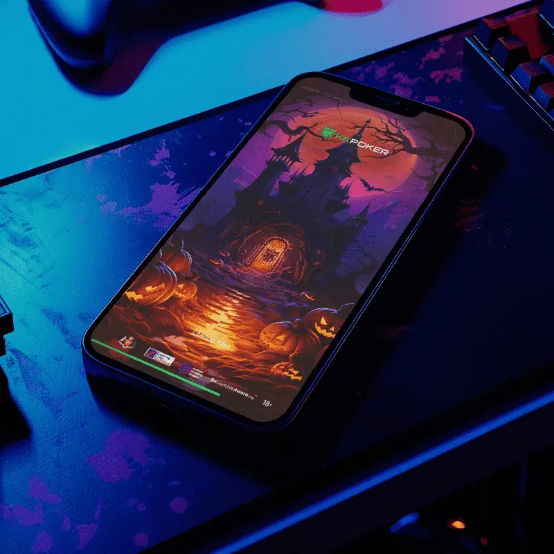
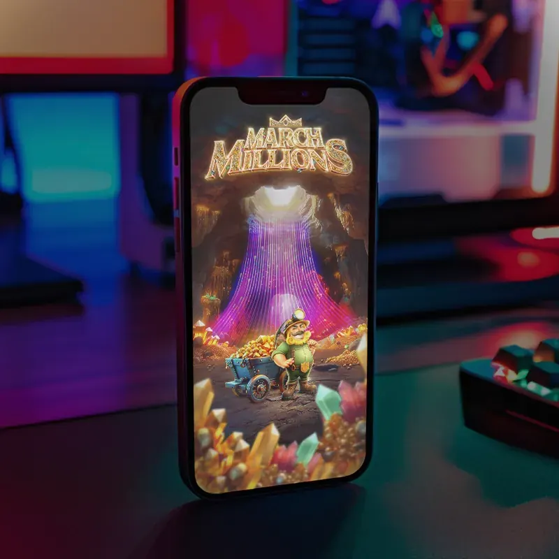
The campaign portfolio spans photorealistic food, anime-inspired storytelling, western action, neon game mechanics, sports environments and premium gold promotions.整套活动视觉涵盖真实食物、动漫叙事、西部动作、霓虹游戏机制、体育场景及高端金色促销等多种风格。
Seven-language delivery required layouts that could absorb major differences in word length, character density and reading rhythm. Typography, line breaks, CTA width and safe zones were designed to remain stable across Latin, Cyrillic, Japanese, Thai and Mongolian scripts.七种语言版本需要应对文字长度、字符密度及阅读节奏的显著差异。排版、换行、按钮宽度与安全区域都需同时适配拉丁字母、西里尔字母、日文、泰文与蒙古文等不同文字系统。
Localisation was therefore treated as a design requirement from the first composition, not as a final production step.因此,本地化并不是最后阶段的文字替换,而是从第一版构图开始就被纳入设计系统。
Social content had to communicate the event proposition within seconds while competing in fast-moving feeds. Strong focal points, compressed messaging and high-contrast calls to action were used to improve scanability.社交媒体素材需要在快速滑动的信息流中于几秒内传达活动价值,因此设计采用明确视觉焦点、精简文案与高对比行动按钮,提高快速阅读与识别效率。
Every composition also integrated certification marks, responsible gaming labels and age restrictions from the beginning. Compliance was treated as part of the visual grid, not added after approval.认证标识、Responsible Gaming 信息及年龄限制也从构图初期就纳入版式系统,而不是在设计完成后被动添加。
AI-assisted exploration accelerated early ideation, while final composition, typography, retouching, localisation and production quality remained under manual art direction. The result was visual range without sacrificing consistency or finish.AI 辅助用于加快前期创意探索,最终构图、字体、修图、本地化及上线品质均由人工完成艺术指导,从而在扩大视觉表现范围的同时保持统一与精致度。