Back返回

Halloween

Turning a Seasonal Theme into a Complete Product Experience将节日主题转化为完整的产品体验

I led the end-to-end UI/UX and visual design of a nine-day Halloween takeover for a global social poker app, launched across Android and iOS in 16 languages. The project extended far beyond a campaign banner. I built a connected seasonal experience across the loading screen, lobby, game table, profile, reward economy, mini-game, shop, tournament surfaces, motion assets and event avatars. The design challenge was to create a highly recognisable Halloween identity without disrupting familiar gameplay patterns or the core brand.我主导了这场为期九天的万圣节主题活动,从 UI/UX、视觉系统到动效及上线资产的完整设计,并面向 Android、iOS 及 16 种语言同步发布。项目并非只制作一张活动 Banner,而是将节日视觉延伸到加载页、大厅、牌桌、个人资料、奖励经济、小游戏、商店、赛事页面、角色头像与动效体验中。核心挑战是在不破坏原有操作习惯与品牌识别的前提下,建立具有强烈节日氛围且统一连贯的产品体验。

Role角色
Lead UI/UX Designer
Scope范围
UX Strategy · Art Direction · UI System · Motion · LocalisationUX 策略 · 艺术方向 · UI 系统 · 动效 · 本地化
Platform平台
Android · iOS
Category类别
Game UI/UX · Seasonal Product Experience游戏 UI/UX · 节日产品体验
Stack工具
Figma · Photoshop · Illustrator · Blender · Midjourney AI
Delivery交付
Global launch in 16 languages16 种语言全球发布
9Days of Live Content持续上线天数
16Localized Languages本地化语言
4Character Assets角色资产
1Unified Seasonal System统一节日系统
Key Art主视觉

Building the visual world, before the first interaction.在第一次交互之前,先建好视觉世界。

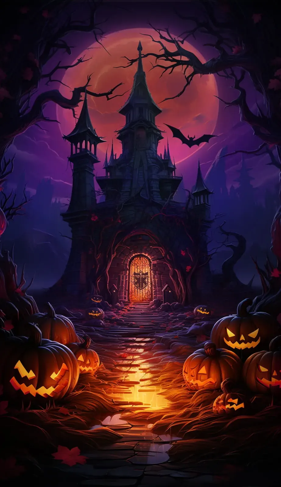
The key art was designed as the visual anchor for the entire event system. Rather than treating it as a standalone illustration, I developed it to establish the colour palette, lighting logic, mood, silhouettes and environmental motifs used throughout the product.主视觉并不是独立插画,而是整套活动设计系统的视觉基准。我通过城堡、血月、南瓜灯路径及环境光效,确立后续页面所使用的色彩、光影、氛围、轮廓语言与装饰元素。

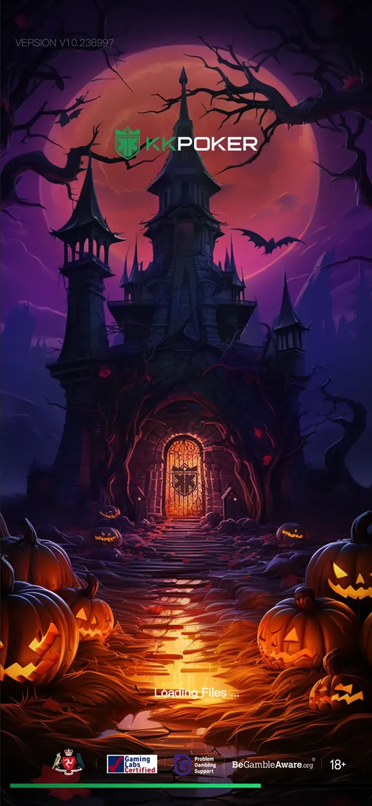
The haunted castle, blood moon and illuminated pumpkin path create a clear focal hierarchy while preserving space for branding, loading indicators and compliance content. The same artwork was adapted into a production loading screen, ensuring that the first visual touchpoint already communicated the event identity without compromising usability.画面在营造沉浸感的同时,也为品牌 Logo、加载进度及合规信息预留清晰区域。主视觉随后直接适配为正式上线的加载页面,让玩家在第一次接触活动时便能感知主题,同时不影响信息读取与功能使用。
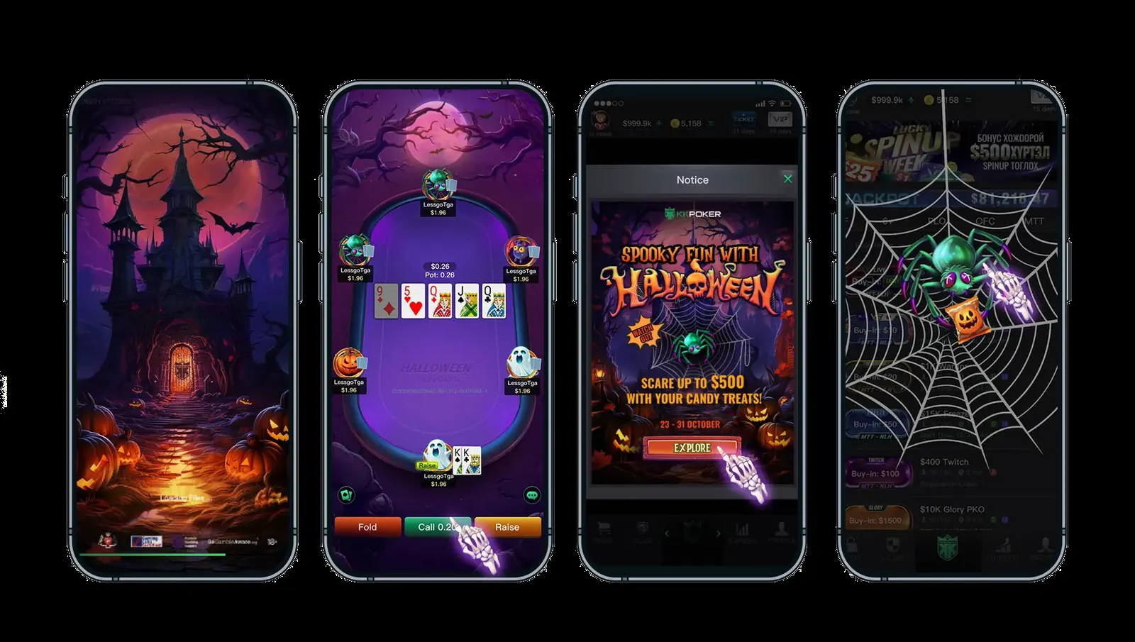
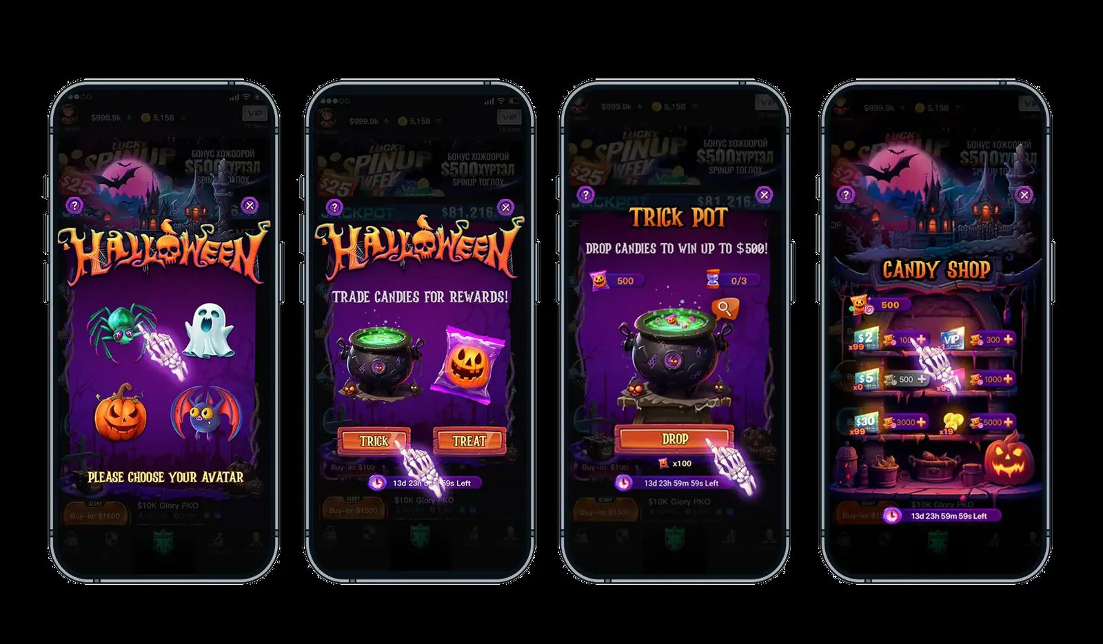
Showcase boards — the ambush & the candy loop总览板 · 惊吓与糖果循环2
Four-phone showcase board — splash art, themed table, notice popup and spider ambush
Four-phone board of the event economy loop
Splash art & loading screen主视觉与加载页2
Haunted castle splash illustration
Concept Artwork概念主视觉Defines colour, lighting, atmosphere and environmental motifs.定义色彩、光影、氛围与环境元素。
Loading screen with logo and compliance footer
Production Loading Screen正式加载页Reframed for logo visibility, loading feedback and compliance requirements.兼顾品牌识别、加载反馈与合规信息。
Discovery & Motion发现与动效

Designing discovery with both clarity and surprise.让活动被发现——既清晰,又有惊喜。

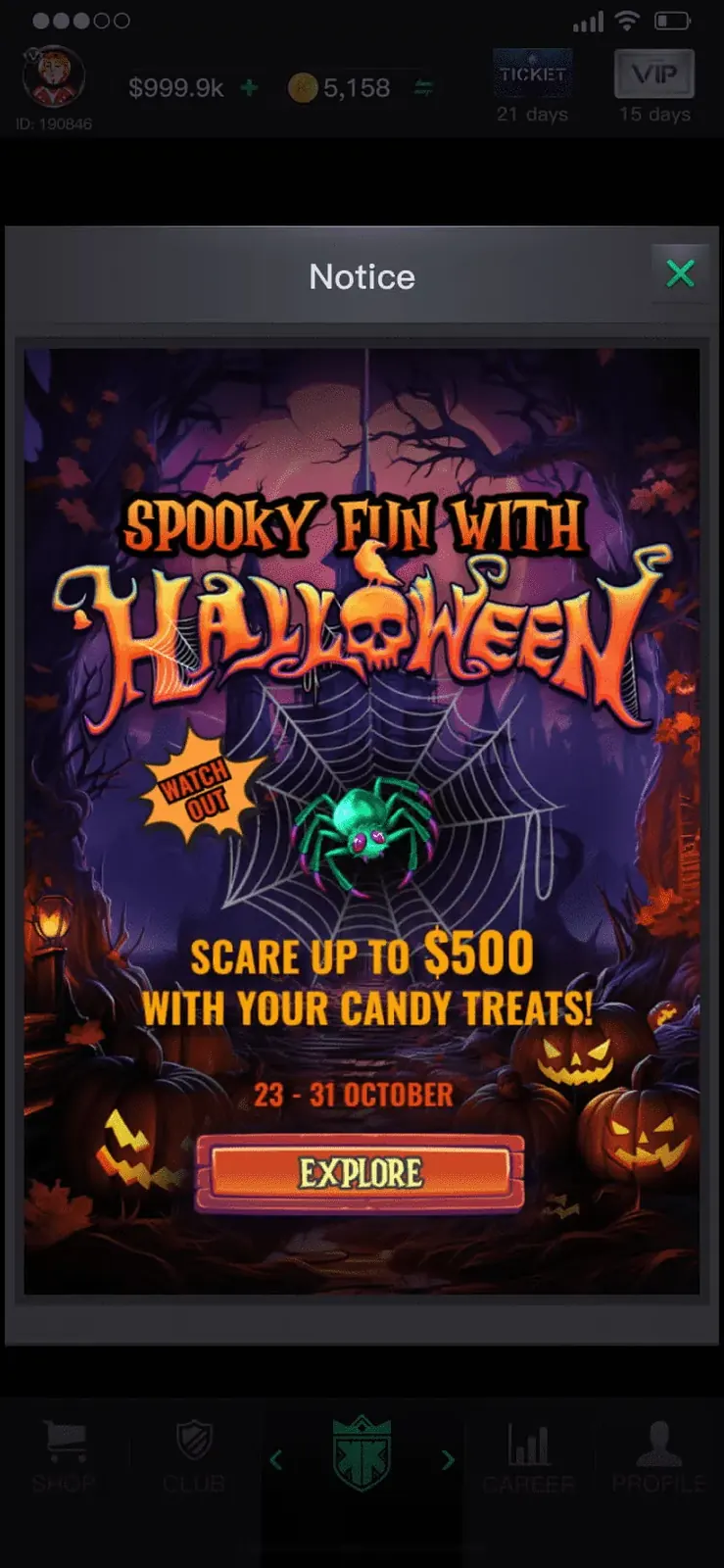
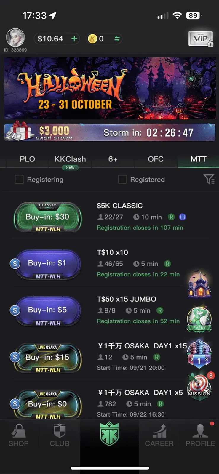
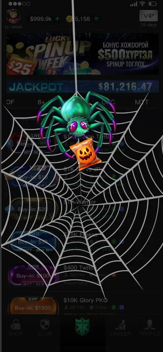
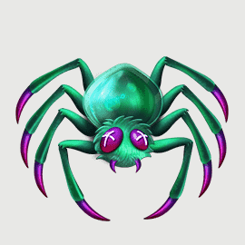
The event entry strategy used two complementary interaction modes. A conventional notice popup and lobby banner communicated timing, rewards and the primary call to action with minimal cognitive load. A full-screen animated spider ambush then added a memorable emotional beat without changing the app's core navigation.活动入口采用两种互补的交互方式。常规公告弹窗与大厅 Banner 负责清晰传递时间、奖励及主要行动按钮,降低用户理解成本;全屏蜘蛛突袭动效则负责制造记忆点与情绪反差,同时不改变应用原有导航结构。

The motion sequence was intentionally short and self-contained: fog establishes atmosphere, the web frames the screen, and the spider directs attention toward the event. This balance between functional communication and controlled surprise helped the campaign feel embedded in the product rather than added on top of it.动效节奏被控制得简短且完整:雾气建立氛围,蛛网框定视线,蜘蛛则将注意力引向活动入口。这样的设计在功能信息与惊喜体验之间取得平衡,使活动真正融入产品,而不是简单覆盖在界面之上。

Announcement & takeover公告与接管3
Spooky Fun with Halloween notice popup
Event Notice活动公告Communicates dates, rewards and CTA in one scan.快速传达日期、奖励与行动入口。
Lobby with Halloween event banner
Lobby Banner大厅 BannerMaintains persistent visibility inside the existing content hierarchy.在原有信息层级中保持持续曝光。
Green spider webbing the entire lobby
Animated Ambush蜘蛛突袭Creates an emotional moment without interrupting navigation.制造情绪记忆点,同时不打断导航。
Candy Economy糖果经济

Turning a seasonal mechanic into a clear reward loop.把节日玩法,变成一条清晰的奖励闭环。

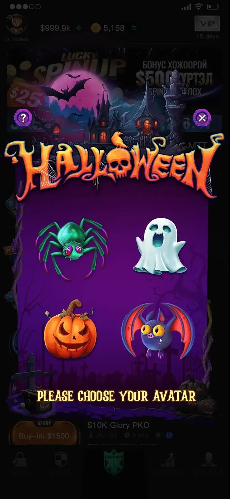
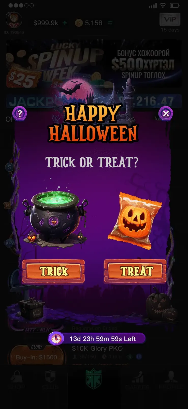
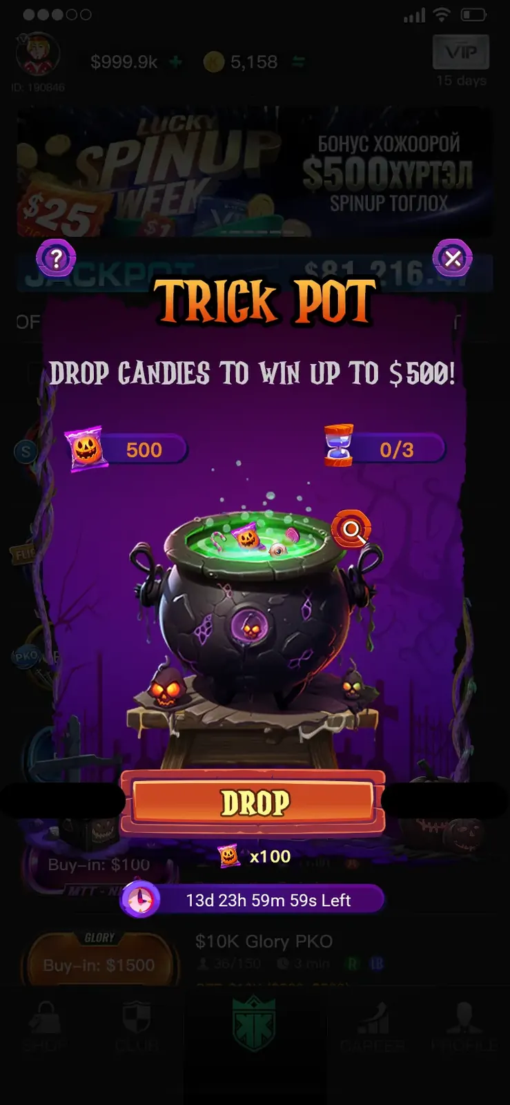
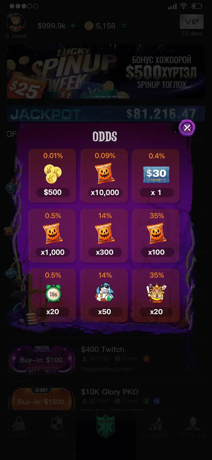
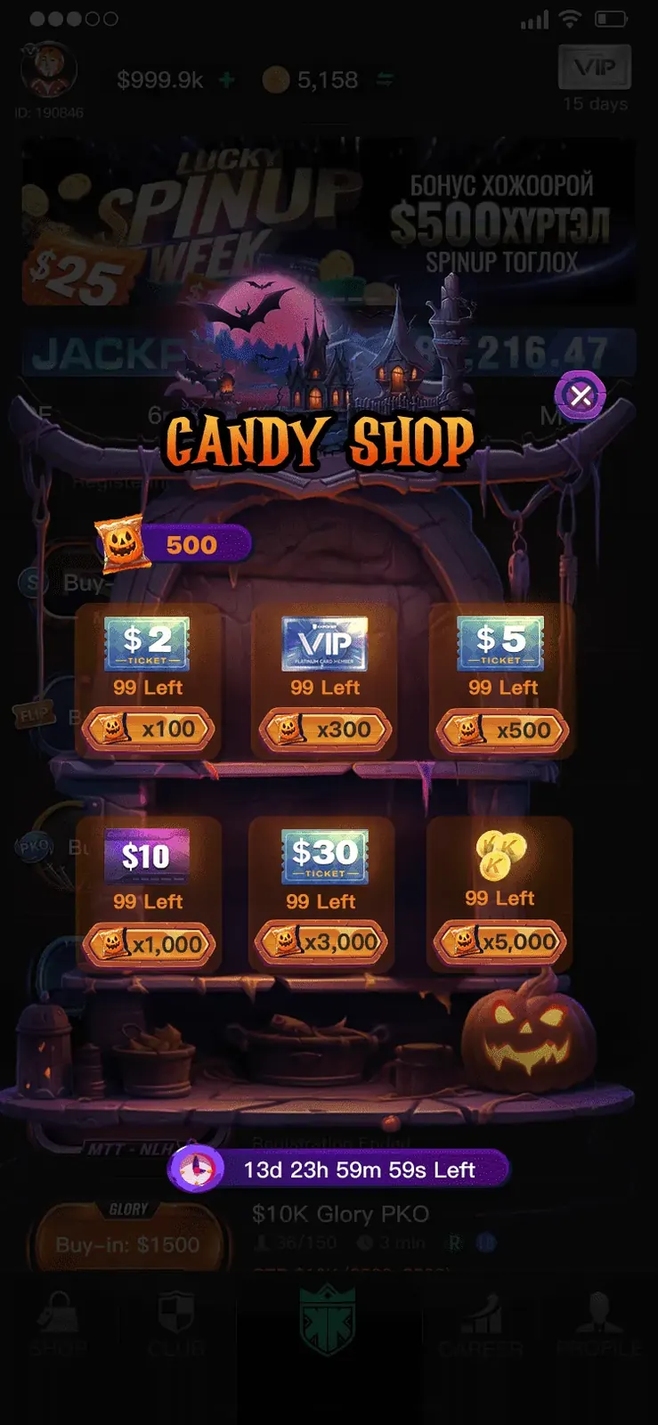
I designed the candy economy as a complete interaction loop: choose a character, make a binary Trick-or-Treat decision, spend earned candy in the pot or shop, review transparent odds, and return to play.我将糖果经济设计为一条完整且易理解的交互闭环:选择角色、进行 Trick or Treat 决策、在奖池或商店中消耗糖果、查看公开概率,再返回游戏继续参与。

Each step uses a clear single-purpose screen, strong CTA hierarchy and consistent visual framing. The odds page was treated as a core trust surface rather than secondary legal content, presenting every reward tier and probability in a compact, scannable grid. This improved transparency while keeping the experience playful and easy to understand.每一步都采用单一任务页面、明确的行动按钮层级及一致的视觉框架。概率页面并未被当作次要合规内容,而是作为建立信任的重要界面,通过紧凑且易扫描的网格清楚展示奖励等级与对应概率,在增强透明度的同时保持趣味性与可读性。

The loop — choose, play, spend循环 · 选择、游玩、消费5
Halloween avatar picker with four characters
Choose Your Avatar选择角色Personalises the experience before the loop begins.在进入玩法前建立个性化参与感。
Trick or Treat choice popup
Trick or TreatTrick or TreatA low-friction binary choice keeps the interaction immediate.低门槛二选一,快速进入玩法。
Trick Pot candy drop mini-game
Trick Pot糖果奖池One dominant action keeps the reward interaction focused.单一主行动按钮,强化操作聚焦。
Odds transparency screen with drop probabilities
Published Odds公开概率Transparent probability strengthens trust in a regulated product.在受监管产品中提升用户信任。
Candy Shop redemption shelf
Candy Shop糖果商店Rewards are grouped by value and availability for fast comparison.按价值与库存组织,方便快速比较。
In motion — ambush, avatars, full run动态 · 袭击、头像与完整流程3
Ambush in motion袭击动效Fog rolls in, the web grows, the spider crawls down with its candy bag.雾气漫入、蛛网蔓延、蜘蛛拎着糖果袋爬下。
Avatar picker in motion选头像动效The four characters idle and react as you choose.四个角色带待机动画,随选择作出反应。
Full walkthrough完整流程实录A one-minute run through the event — drop, win, repeat.一分钟完整流程——投糖、中奖、再来一轮。
Core App Integration核心整合

Extending the theme without breaking the product.延展主题,而不破坏产品。

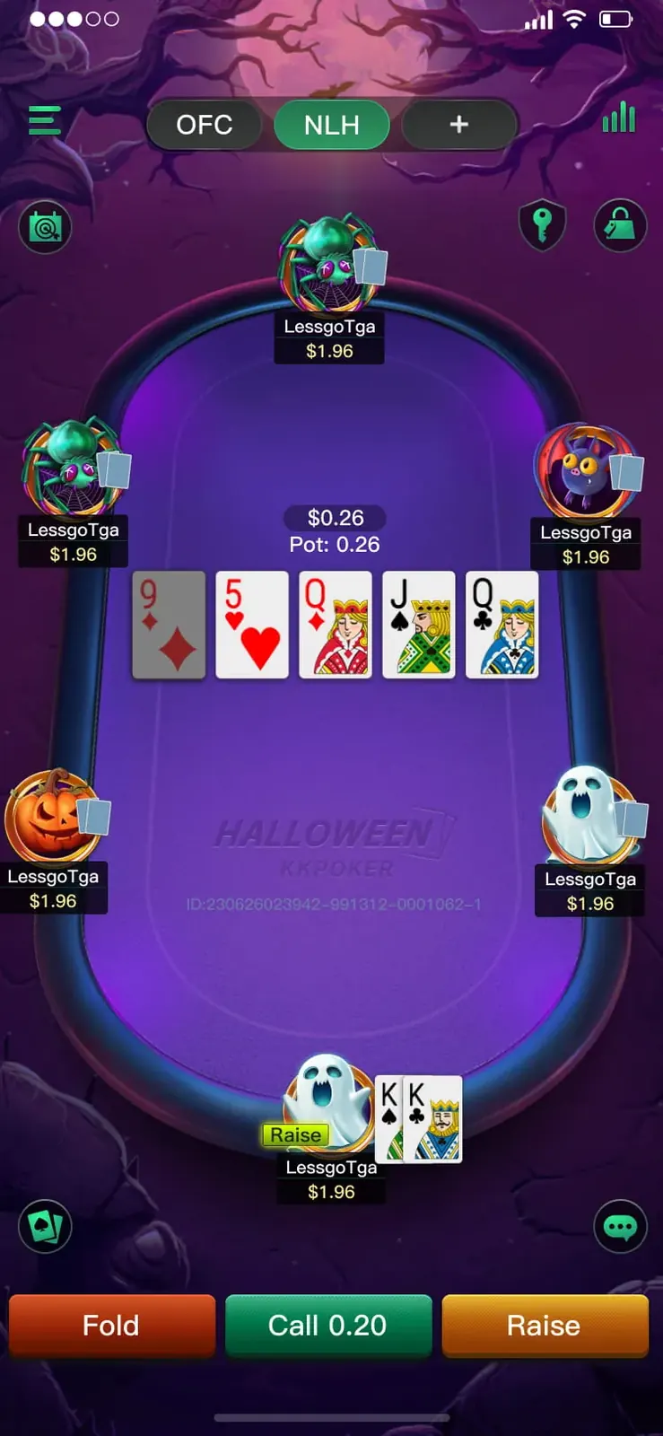
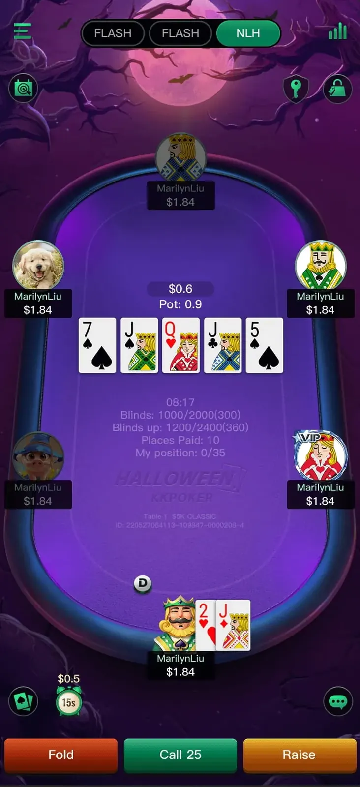
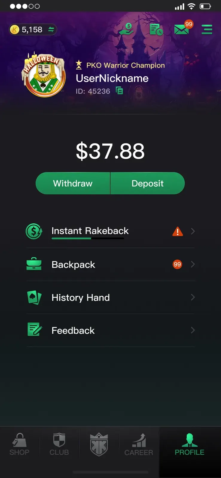
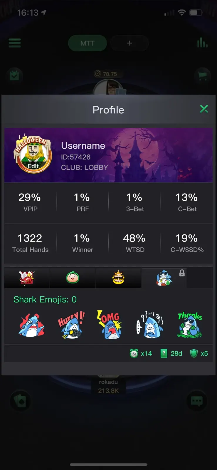
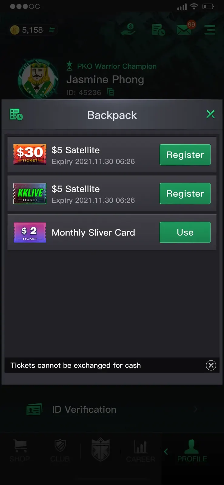
A successful seasonal takeover needed to remain recognisable even inside the core poker experience. I adapted the theme across the table felt, seat avatars, profile frame, statistics popup and backpack while preserving established interaction zones, contrast levels and gameplay readability.真正完整的节日接管,需要在核心牌局中依然保持主题一致。我将万圣节视觉延伸至牌桌桌布、座位角色、个人资料边框、数据弹窗及背包页面,同时保留原有交互区域、对比关系与牌局信息可读性。

The system relies on controlled visual substitution rather than redesigning the entire interface. Seasonal colours, ribbons, motifs and character assets occupy defined brand-safe areas, allowing the product to feel transformed while its navigation and functional hierarchy remain familiar.整套设计采用“受控替换”而非彻底重做界面的方式。节日色彩、丝带、装饰图形与角色资产只进入预先定义的安全区域,使产品看起来焕然一新,同时让用户仍能依靠熟悉的导航及功能层级完成操作。

Theme across the core app主题贯穿核心界面5
Table with all six seats using Halloween avatars
Avatars in Play牌局角色Character identity appears directly inside the core game loop.将活动身份直接带入核心玩法。
Halloween table skin with purple felt
Table Skin牌桌皮肤Seasonal atmosphere without reducing card or control visibility.增强节日氛围,同时保持牌面与按钮清晰。
Profile page with Halloween avatar frame
Profile Frame个人资料边框A lightweight branded layer preserves the existing information structure.轻量品牌层,不破坏原有信息结构。
Player stats popup with event emoji rewards
Stats Popup数据弹窗Rewards and seasonal assets integrate into a familiar data surface.在熟悉的数据页面中融入节日奖励资产。
Backpack inventory with won tickets
Backpack背包Provides a clear destination for rewards earned through the event loop.为活动所得奖励提供明确的承接位置。
Finale & Localisation决赛与本地化

Scaling one campaign across markets and high-stakes moments.让一场活动跨越市场与高光时刻。

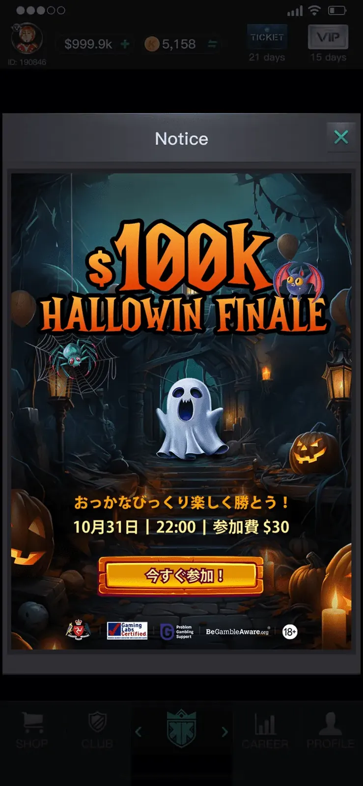
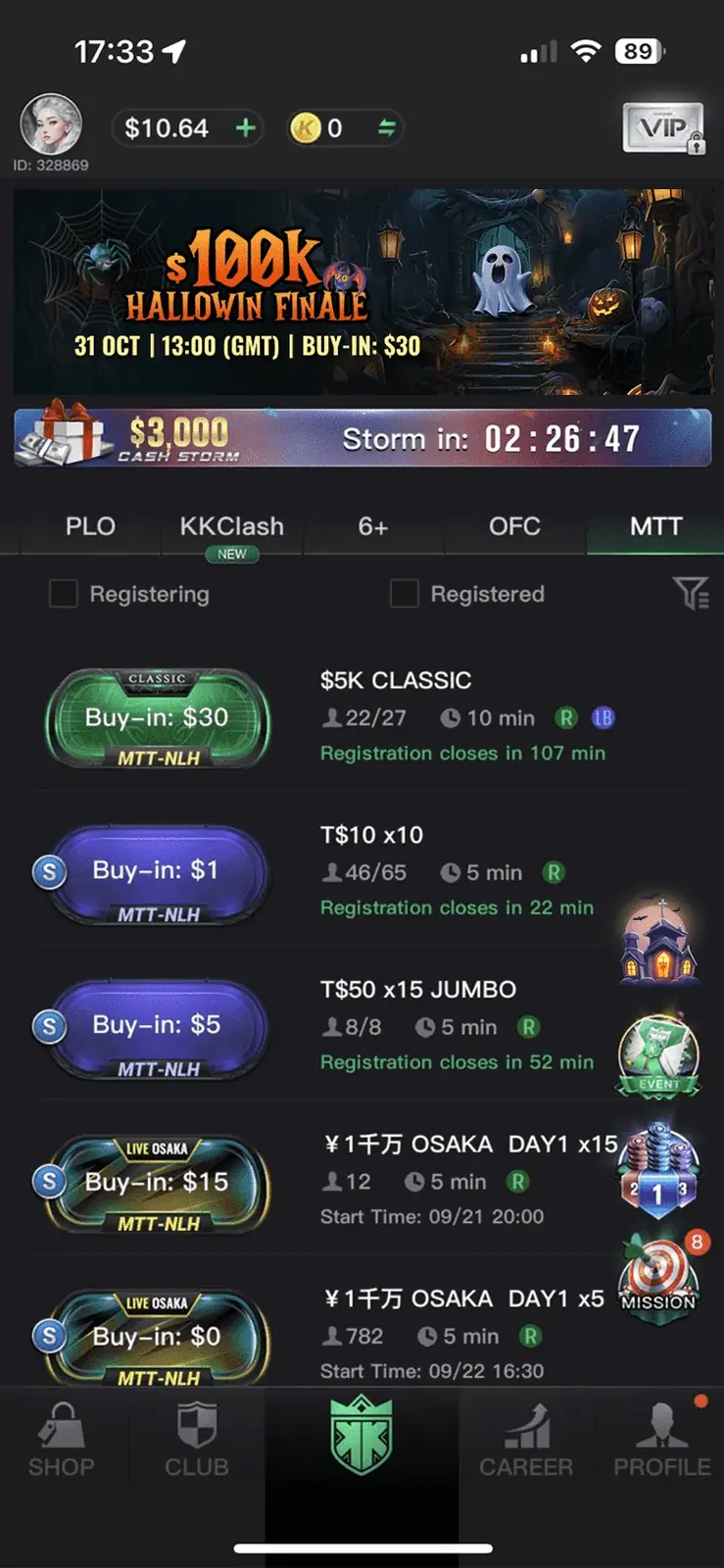
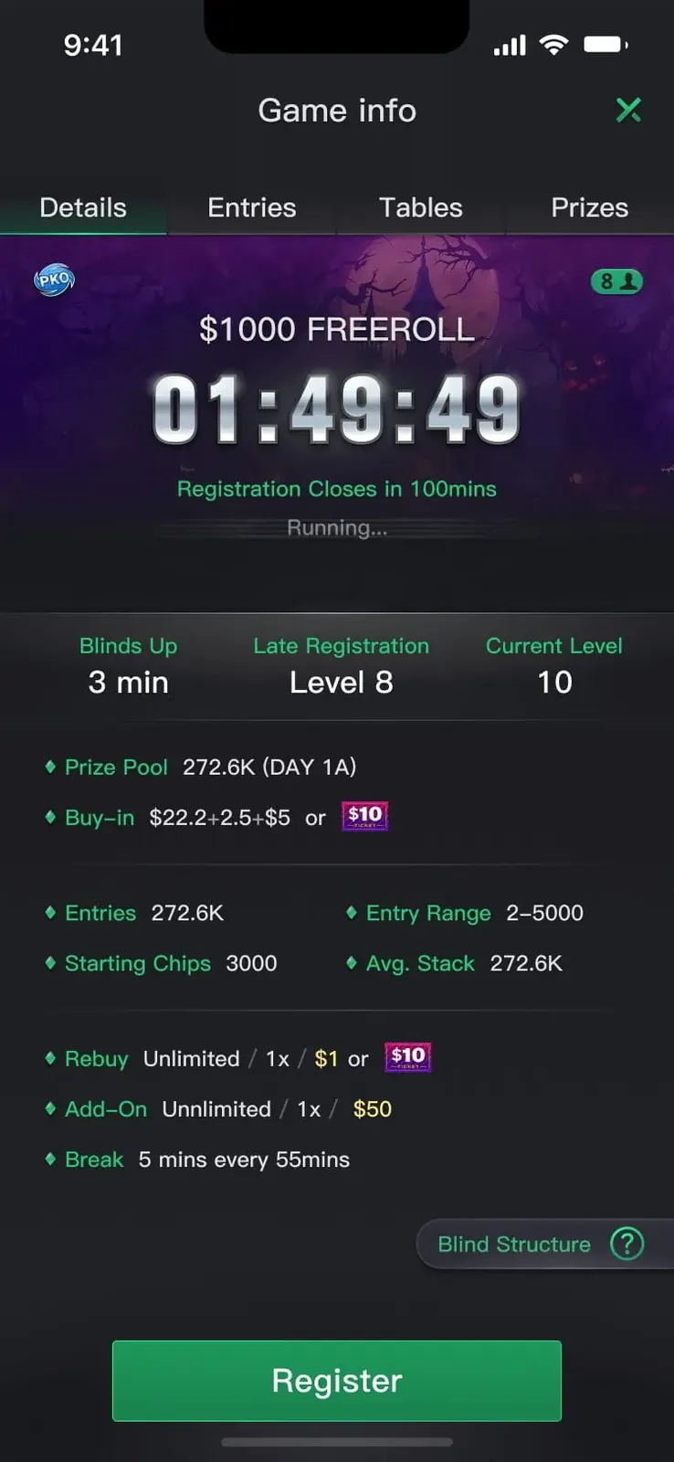
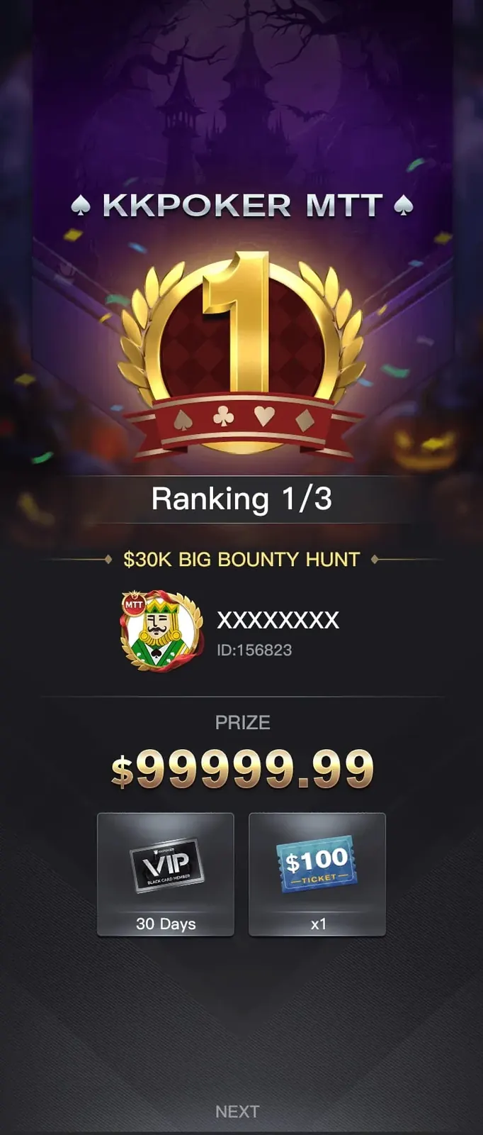
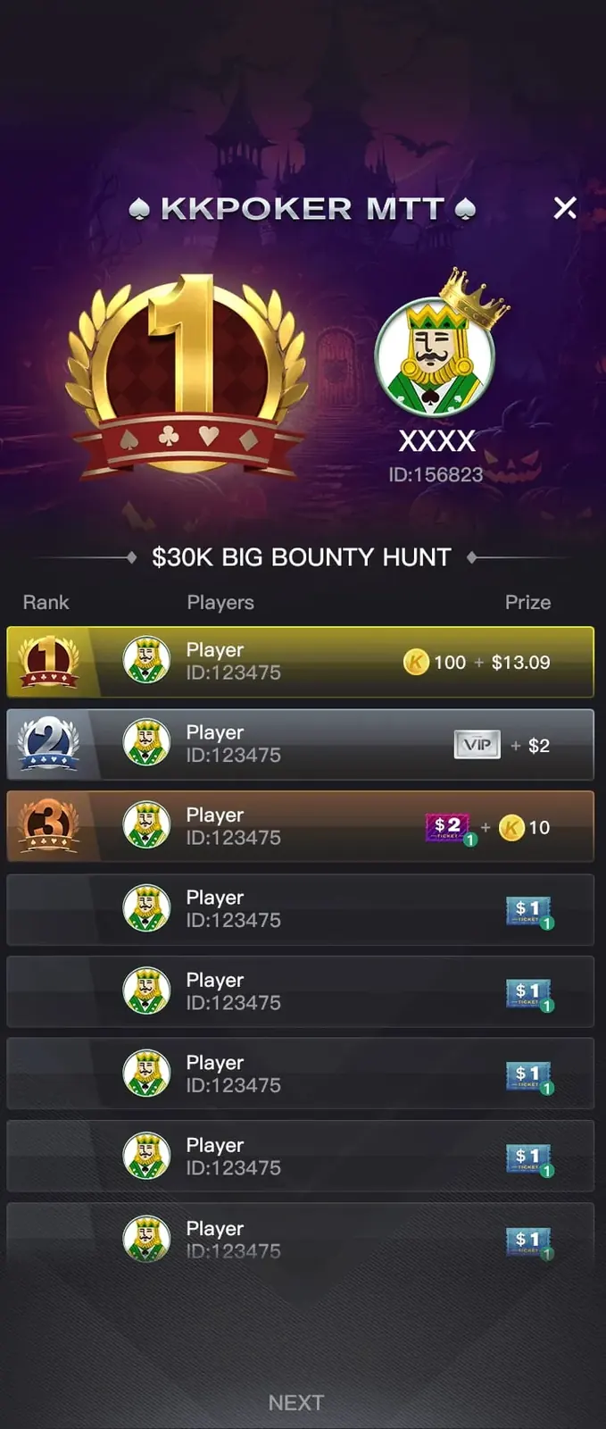
The nine-day campaign culminated in a high-value finale, requiring a distinct sense of escalation while remaining part of the same visual system. I designed the finale notice, live lobby banner, game information page, winner screen and payout board as one connected flow from discovery to registration, competition and reward.九天活动最终汇聚到高奖金决赛,因此界面需要表现出明显升级感,同时仍属于同一视觉系统。我将决赛公告、实时大厅 Banner、赛事信息页、冠军页面及奖金排行板设计成完整流程,覆盖发现、报名、比赛及领奖等关键节点。

All major surfaces were prepared for global localisation across 16 languages. Flexible text containers, controlled line lengths, scalable typography and modular artwork allowed regional copy variations to fit without weakening hierarchy or brand consistency. The Japanese production example demonstrates how the same system adapts to different text density and reading patterns.所有主要页面均为 16 种语言的全球本地化预留弹性。通过可伸缩文本容器、受控行长、灵活字号与模块化画面,使不同语言长度都能适配而不破坏信息层级与品牌一致性。日文版本进一步验证了系统面对不同文字密度与阅读方式时的适应能力。

Finale surfaces决赛界面5
Japanese-localized $100K Hallowin finale notice
Finale Notice决赛公告Creates urgency while keeping reward and timing instantly legible.制造紧迫感,同时确保奖励与时间易读。
Lobby with finale banner
Live Banner实时 BannerConnects the campaign identity with live tournament information.连接活动品牌与赛事动态信息。
Tournament game info screen with Halloween header
Game Information赛事信息Prioritises structure, registration state and prize pool.突出赛制、报名状态与奖金池。
Tournament winner screen among pumpkins
Winner Screen冠军页面Turns completion into a highly shareable reward moment.将结算转化为具有传播感的奖励时刻。
Payout leaderboard
Payout Board奖金排行Preserves data clarity inside the seasonal visual language.在节日风格中保持数据清晰度。
Character System角色系统

Creating distinct characters within one reusable asset language.在同一套资产语言里,创造性格分明的角色。

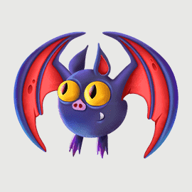
The four characters were designed as functional product assets rather than decorative illustrations. Each needed to remain recognisable at small avatar scale, animate clearly, fit different UI containers and share a consistent level of detail, lighting and colour saturation.四个角色并不是单纯的装饰插画,而是需要在产品中重复使用的功能资产。每个角色都必须在小尺寸头像中保持辨识度,适合动画表现,能够进入不同 UI 容器,并在细节、光影与色彩饱和度上保持统一。

AI-assisted exploration accelerated early silhouette and personality development, while final art direction, cleanup, colour control and production adaptation were completed manually. The resulting system supports profile use, in-game seats, promotional surfaces and motion without losing character identity.AI 辅助用于加快前期轮廓与性格方向探索,最终的艺术指导、结构修整、色彩控制及上线适配均由人工完成。最终角色系统可以稳定应用于个人资料、牌桌座位、宣传页面及动效内容,同时保持鲜明个性。

Bat event avatar render
BatEvent avatar活动头像Compact silhouette with strong wing recognition at small scale.紧凑轮廓,在小尺寸下仍具强辨识度。
Ghost event avatar render
GhostEvent avatar活动头像Simple volume and facial expression support readable animation.简洁体块与表情,便于动画阅读。
Pumpkin event avatar render
PumpkinEvent avatar活动头像Uses colour contrast and facial lighting to remain expressive in UI.通过色彩对比与面部光效保持表现力。
Spider event avatar render
SpiderEvent mascot活动主角Built as both mascot and full-screen motion trigger.同时承担吉祥物与全屏动效触发角色。
The Takeaway总结
One seasonal system, applied across the entire product.一套节日系统,贯穿整个产品。
The value of the project was not a single Halloween campaign asset, but a scalable seasonal design system that changed the emotional tone of the whole product while preserving usability, trust and brand recognition. By combining UX strategy, modular UI, key art, motion, character production, AI-assisted exploration and localisation planning, I created a connected experience that could move consistently from loading screen to live gameplay and from discovery to reward.这个项目的核心价值并非某一张万圣节素材,而是一套可扩展的节日设计系统:它改变了整个产品的情绪氛围,同时保留了可用性、信任感与品牌识别。通过整合 UX 策略、模块化 UI、主视觉、动效、角色制作、AI 辅助探索及本地化规划,我建立了一套从加载页到真实牌局、从活动发现到最终奖励都保持一致的完整体验。
More game projects更多游戏项目
March Million
March MillionGame UI/UX
Game Table
Game TableGame UI/UX
Poster
PosterGame UI/UX
Invitees
InviteesGame UI/UX
Achievement
AchievementGame UI/UX