Back返回
Back返回

VV WORK

An Enterprise Design System, Built from Zero从零建立的企业级设计规范

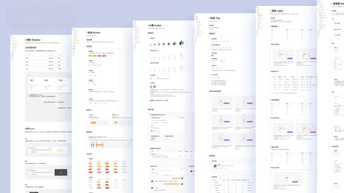
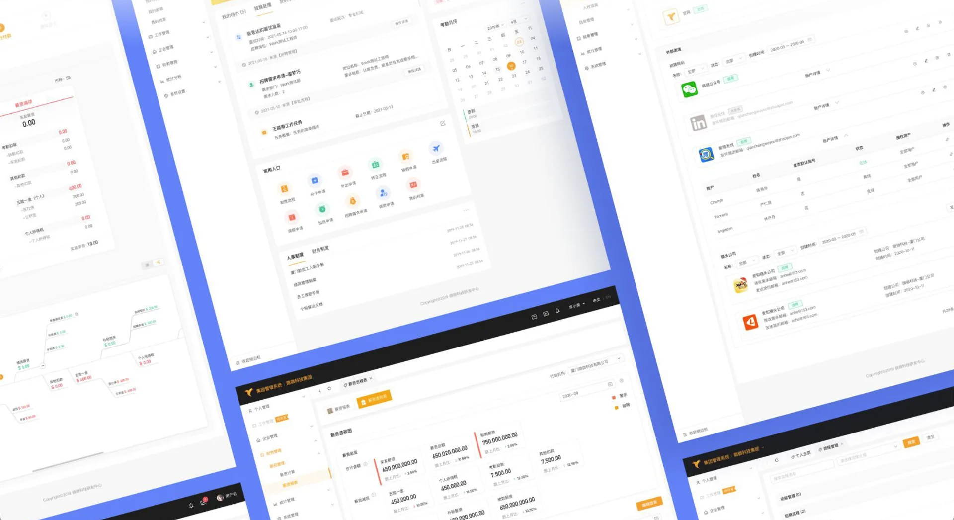
A B2B group-management platform serving multiple business lines. As lead designer I built its design standard from the ground up — auditing the chaos, defining principles, and shipping a token-to-component system the whole team runs on.一套服务多业务线的集团管理系统。作为主设计师,我从零建立它的设计规范——梳理混乱、确立原则,交付一套从设计令牌到组件库、全团队共同运转的系统。

Role角色
Lead UI/UX Designer主设计师
Scope范围
Spec → Tokens → Component Library规范 → 令牌 → 组件库
Platform平台
Enterprise Web · B2B企业级 Web · B2B
Stack工具
Figma · Illustrator · Principle · Sketch
24Grid Columns栅格列
8ptSpacing Base间距基准
5Color Families色彩体系
6Process Steps实施步骤
3Breakpoints适配断点
The Problem需求背景

A system that grew without rules.一个在没有规则中长大的系统。

At the project's start, no design spec or extension rules were established — and no lead designer guarded the global style. Iterations passed through many designers: controls drifted, styles multiplied, and collaboration itself bred interface deviations.项目之初,未确立好设计规范和拓展规则,没有主设计师把控全局样式。而后在迭代中经手多名设计师:迭代控件不一致、设计风格多样不统一,多名设计师协作过程中产生界面误差。

The result: the same page type existed in multiple styles, the same component behaved in multiple ways, and cross-business overlap collapsed consistency. The system lacked wholeness, implementation quality was uncontrollable, and the experience suffered.导致同一类型页面/控件存在多种样式,同一类型组件出现多种交互形式,多业务交叉造成一致性问题。系统缺乏整体性,落地效果不可控,体验较差。

Design efficiency low设计效率低

Too many styles force designers to re-confirm styling again and again during iteration — time lost, output slow.过多样式导致设计人员在迭代任务中,再三确认样式耗时长,效率低。

Handoff efficiency low对接效率低

Style sprawl multiplies dev-handoff pain: costly communication, confused design pages, poor restoration fidelity.过多样式导致对接研发难点多:沟通费时、混淆设计页面、还原度不理想等。

User experience hurt影响用户体验

One component in many styles confuses operation and raises users' cognitive cost — the experience pays the price.同一组件有多种样式,混淆操作、增加用户认知成本,影响用户体验。

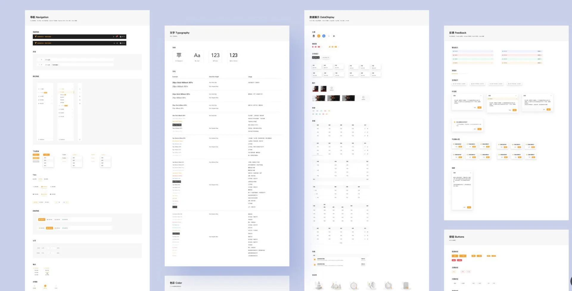
Affected: detail pages涉及:详情页Forms表单页Tables表格页面Lists列表页Dashboards仪表页Workbench工作台Editor编辑器Flows流程
Design Principles设计原则

Four principles, one goal: burden-free use.四条原则,一个目标:无负担的使用。

Simplicity mastering complexity — always pursue operations and feedback close to the real and natural; through mapping and metaphor, keep human-computer interaction in an unconscious state. Users should always know what a click will do, what state the system is in, and what the next step is.以简驭繁——时刻追求贴近真实自然的操作/反馈,通过映射、隐喻等方式将人机交互控制在无意识的状态下。要让用户明确点击后会发生什么、系统处于什么状态、下一步操作是什么,使其无负担地使用。

Efficient高效Predictable

Predictable operation flows, clear unambiguous language, real-time feedback, a friendly comprehensible interface. Same-type pages keep a consistent layout structure, interaction pattern and design language.可预见的操作流程,清晰且表意明确的语言,实时的操作反馈,友好易懂的界面。同类型页面保持一致的布局结构、交互方式、设计语言等。

Concise简洁Restrained

Stay restrained: a clear design language and style system, never blindly adding rules. Present important functions and content effectively; avoid information redundancy.保持克制,清晰的设计语言及风格体系,不盲目追加设计规则。有效展示重要功能/内容,避免信息冗余。

Controllable可控Forgiving

Offer operation suggestions or hints scaled to scenario complexity; state solutions clearly in extreme cases. Actions can be undone, rolled back or deleted — lowering the frustration of mistakes.依据业务场景的复杂度提供操作建议或提示,极端情况明确告知解决方案。操作可撤销、回退、删除,降低用户操作失误后的挫败感。

Extensible延展性Objective

Cover the full business need and adapt to change: flexible, extensible elements and components. Objectified design rules minimise the designer's subjective interference.全面覆盖商业的业务需求,并适应不同业务的变化,灵活可拓展的设计元素/组件。对象化的设计规则,尽量降低"设计者"的主观干扰。

The Process实施流程

Six steps from chaos to component library.从混乱到组件库的六步流程。

Lead designer (myself), special-project members and an expert review group — with schedule and responsibilities defined, the spec advanced step by step.确定主设计师(本人)、专项成员和专家评审小组,确定排期和职责范围,按流程逐步推进规范建设进程。

Audit梳理01

Lead designer audits site-wide common and business-specific scenarios; classify existing styles, page types, layout structures, control types, interaction forms.主设计师梳理全站通用及各业务线特有的业务场景。初步分类:理清既存设计样式、页面类型、布局结构、控件类型、交互形式等。

Outline定大纲02

From the audit docs — weighing product positioning, business direction and spec extensibility — establish the outline. The naming system is built at this stage.根据梳理文档,充分考虑产品定位、业务发展方向、规范可拓展性,确立大纲。并在此阶段建立起相应的命名体系。

Consolidate汇整03

Lead and business designers split work per outline: lead owns global styles; business designers own business content; consolidate categorized styles and controls.主设计师和各业务设计师明确分工,依据规范大纲,主设着手全局样式、业务设计师负责业务相关内容,汇总分类样式、控件等。

Optimize优化04

Follow the principles; weigh each control's extensibility, adaptability to business change and fit with usage scenarios — subtract further, refine the spec.遵循设计原则,充分考虑各类控件/规范可拓展性、是否适应业务变化、与使用场景的契合度,进一步做减法,优化规范样式。

Review & Ship评审输出05

Output the spec document; hold the review — present the philosophy, results and usage-scenario examples; adjust per positioning, direction, extensibility.输出规范文档,召开规范评审,宣讲设计理念、成果展示及使用场景示例说明。综合产品定位、业务走向、可拓展性评审调整。

Componentize组件化06

Create the component library per the outline and naming rules. Managed centrally by the lead via the company's collaboration system, synced to team, product and engineering.按照规范大纲、遵守命名规则,创建组件库。通过公司自研协同系统,由主设统一管理,并同步给组内成员、产品、研发。

Layout Spec规范布局

A 24-column grid, spaced on 8 points.24 栅格,8 点间距法。

A 24-column grid standardizes page layout and adapts to screen sizes, optimizing display across resolutions. An 8-point grid governs element spacing — 8 / 16 / 24 / 32 / 40 / 48 — keeping every interface visually consistent.使用 24 栅格系统来规范页面布局、适配不同屏幕尺寸,使界面在不同分辨率中显示效果最优化。基于 8 点网格法制定各元素间距,确保不同界面之间的视觉一致性。

Nav · fixed导航 固定宽度
Nav — fixed width导航 · 固定宽度Content — adaptive width · 24 columns内容区域 · 自适应宽度 · 24 栅格
8px
16px
24px
32px
40px
48px
Adaptation Rules规范适配规则

Three breakpoints, every page type covered.三档断点,覆盖每类页面。

Adaptation rules span three viewport ranges and every page family — workbench & lists, detail pages, card layouts — so behaviour is defined, not improvised.适配规则覆盖三档视口区间与每类页面——工作台/列表页、详情类页面、卡片模式布局——行为是被定义的,不是临场发挥的。

< 1280
content = 990 min内容宽 990 不再变窄
  • Content stops narrowing at 990px; fixed side padding内容宽度=990 不再变窄,两侧留白固宽
  • Left nav collapses to reclaim space收起左侧导航
  • Overflow scrolls beyond viewport部分内容超出视窗区域可滚动
1280 – 1920
content adapts内容区域自适应宽度
  • Content area adapts fluidly内容区域自适应宽度
  • Fixed side padding both sides两侧留白固宽
  • Card layouts reflow per width卡片布局按宽度回流
> 1920
detail = 1500 max详情内容 1500 封顶
  • Workbench & lists stay adaptive工作台/列表内容自适应宽度
  • Detail pages cap at 1500px详情类内容宽度=1500 不再加宽
  • Side padding turns adaptive两侧留白自适应宽度
Colors & Icons规范配色与图标

Tokens: five colors, five icon sizes.设计令牌:五色体系,五档图标。

Every colour lives in a family with tint ladders for states and surfaces; every icon is drawn on a keyline grid and shipped in five sizes, in both linear and filled sets.每个颜色都有自己的家族与透明度阶梯,用于状态与表层;每个图标都基于栅格线(keyline)绘制,提供五个尺寸档位,线性与面性两套。

Primary
#30B8A9
Grey
#262626
Blue
#5590F6
Green
#44C69D
Red
#F55656
16px
20px
24px
32px
48px

Icons are constructed on a keyline grid for optical consistency, delivered as linear and filled libraries covering the platform's full operational vocabulary.图标基于栅格辅助线绘制以保证视觉一致性,交付线性与面性两套图标库,覆盖平台完整的操作语汇。

Empty States优化空状态

Empty states that speak the brand.让空状态说品牌的话。

The system shipped with Ant-Design's default empty components — functional, but tone-deaf to the brand. The new version redraws every empty state in brand colour and grey tones, customized per scenario: no permission, no data, under construction, and more.当前系统使用 Ant-Design 自带组件作为空值效果,缺乏品牌调性。新版用品牌色+灰阶色调重新绘制,按场景定制:无权限、无数据、待开发等。

Componentization组件化设计

Break pages into atoms, grow a library from them.把页面拆到原子,再长出组件库。

Decompose the interface layer by layer down to its smallest atoms; build components and styles from atoms upward, nesting and combining into the system's component library. Componentization sustains the spec, lifts collaboration efficiency, and cuts design-QA time.将页面中的设计元素逐层拆解,直至拆分出最小元素(原子)。从最小元素开始创建组件/样式,通过层层嵌套组合,逐步建立起系统组件库。组件化设计有利于设计规范的延续和统一,提高协作效率,减少走查问题的处理时间。

Typical interfaces典型界面 Query & form modules查询、表单模块 Inputs & buttons编辑框、按钮 Colour · text · shadow颜色、文字、阴影 Components & styles创建组件/样式
The Takeaway总结
A design system isn't decoration — it's infrastructure.设计规范不是装饰——是基础设施。
One spec and one component library turn design decisions into team assets: designers stop re-confirming styles, engineers get a single source of truth, users get one coherent product. The lead designer's real deliverable isn't a page — it's the rules every page obeys.一份规范、一套组件库,把设计决策变成团队资产:设计师不再反复确认样式,研发有了唯一可信来源,用户得到一个连贯一致的产品。主设计师真正的交付物不是某个页面——而是每个页面都遵守的规则。
Deliverables成果输出
Website网站展示
More UI/UX projects更多 UI/UX 项目
TAVELLA
TAVELLAUI/UX
SplitKaki
SplitKakiUI/UX
VV Life
VV LifeUI/UX
Petal
PetalUI/UX
FoodSpace
FoodSpaceUI/UX