◇ Final Screens成果展示
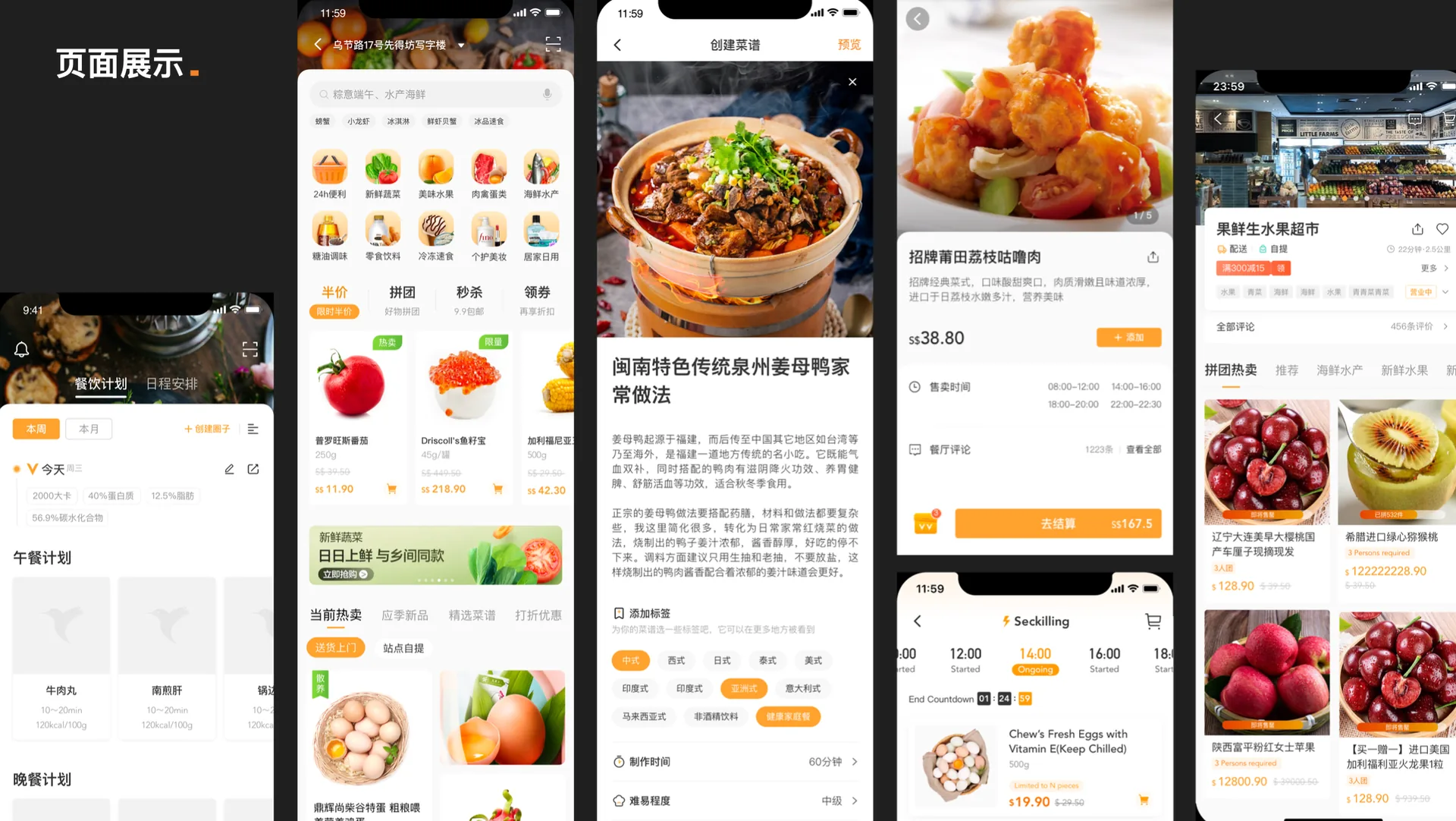
Social-Commerce Grocery for Southeast Asia面向东南亚的社交电商生鲜 App
A social-commerce grocery app for Southeast Asia. From market research and competitive teardown to a full interface system — designed around how Southeast Asian shoppers actually discover, decide and buy.一款面向东南亚市场的社交生鲜电商 App。从市场调研、竞品拆解到完整界面系统——围绕东南亚用户真实的"发现—决策—购买"路径来设计。
Southeast Asia isn't a smaller version of the China market — it shops differently. Users are social-native, price-sensitive, patient with delivery but anxious about product quality they can't touch. Most grocery apps copy a generic e-commerce layout that ignores this.东南亚不是"缩小版的中国市场"——它的购物方式截然不同。用户社交原生、对价格敏感、能接受较慢的配送,却对"看不见摸不着"的商品品质格外焦虑。多数生鲜 App 直接套用通用电商版式,忽略了这一点。
VV LIFE's goal: design a grocery experience that leans into social discovery, builds trust where users feel uncertain, and fits regional shopping rhythms — not a template transplanted from elsewhere.VV LIFE 的目标:设计一套顺应社交式发现、在用户不确定处建立信任、贴合区域购物节奏的生鲜体验——而不是从别处照搬的模板。
Research first: when users are active, who they are, and what drives them to buy. The numbers below anchored every later design decision.调研先行:用户何时活跃、是谁、被什么驱动购买。下面这些数字锚定了之后每一个设计决策。
Active hours by market: Indonesia peaks midday (11–13h); Taiwan & Singapore late night (22–24h); Malaysia, Thailand, Vietnam and the Philippines span 11–15h and 20–22h. Mobile commerce and internet penetration are high; English is the common language of e-commerce; logistics and online payment are mature.各市场活跃时间:印尼午间活跃(11–13点);台湾、新加坡晚间(22–24点);马来、泰国、越南、菲律宾集中在 11–15 点、20–22 点。移动电商与互联网普及率高,英语是电商发展主要语言,物流发达、在线支付便利。
Huge active user base spending 6–8h daily; social media and short video consume the most time. Most purchases convert through social platforms — sharing and entertainment are the culture; evening phone-scrolling is the ritual.大量活跃用户,日均使用 6–8 小时,耗时最多的是社媒与短视频。多数成交通过社交平台,热爱分享和娱乐,喜欢晚上刷手机。
Paycheck-to-paycheck spenders; promo-season sales spike. They favour low-ticket items, react to low prices and free shipping, love social sharing — flash sales and group-buys perform strongly.月光族,促销季销售数据猛增。消费倾向低客单价单品,对低价和免运费敏感,社交分享诉求高——秒杀、拼团、砍价很受欢迎。
Patient with 2–5 day delivery, but cautious about registration and order-efficiency features. When problems arise they turn first to chat support and FAQs — rarely a phone call.非常有耐心等待 2–5 天的配送,对注册、订单等效率型功能比较谨慎小心。遇到问题首选客服聊天和常见问答,少有电话客服。
High tolerance for visual richness, strong appetite for emotional, playful, youthful design. Official and cold-industrial styles feel distant — even unfriendly.视觉审美包容度强,情感化诉求高,喜欢低龄和有趣。不太喜欢官方和正式,认为严肃和冷工业风格有距离感,甚至冷冰冰。
Three stages — Guided Shopping → Transaction → Post-Purchase — tracked across behaviour, touchpoints and emotion. The curve below is the emotional terrain: peaks where the experience delights, valleys where design must work hardest.三个阶段——导购 → 交易 → 交易后——追踪行为、接触点与情绪。下方曲线是情绪地形图:高峰是体验的亮点,低谷正是设计最该发力之处。
The detail page carries conversion, so I dissected three benchmarks — each strongest at a different zone of the page. Together they define what a complete detail page needs.详情页承担转化率,所以我拆解了三个标杆——各自在页面的不同区域最强。合起来定义了一个完整详情页需要什么。
Main image/video, brand title, price-drop alerts, share. Ratios mostly 1:1, some 2:3 vertical.主图/短视频、品牌标题、降价通知、分享。比例多为 1:1,也有 2:3 竖向。
Platform guarantee, estimated delivery, 8-hour returns, late-delivery compensation — trust that consolidates the decision.平台保障、预计送达、8 小时内可退、晚点包赔——用信任巩固决策。
Coupon zone stimulates decision and distributes traffic; multi-dimensional ratings plus related recipes close the loop.优惠区刺激决策 + 流量分发;多维度评价加相关菜谱收尾。
Distilled blueprint: ① base info — main image / short video · ② price + brand endorsement · ③ an info form of offers + service + assurance. These three elements became the skeleton of VV LIFE's own detail page, shown next.提炼蓝本:①基础信息——主图/短视频 ②价格 + 品牌背书 ③优惠区 + 服务区 + 保障区的信息表单。这三要素成为下一节 VV LIFE 自有详情页的骨架。
Mainstream e-commerce platforms share a consistent home layout — which lowers users' learning cost and indirectly lifts conversion. VV LIFE follows that grammar; the wireframe shows each zone and why it earns its place.主流电商平台的首页排布较为一致——降低了用户的学习成本,间接提高了转化率。VV LIFE 沿用这套语法;线框图展示每个区域及其存在的理由。
Strengthens users' awareness of search.加强用户对搜索的感知。
Pulls attention to campaign content.活动内容的吸引力。
Horizontal or two-row icons let goal-directed users identify fast.顶部横向或两行图标,目标明确的用户快速识别。
Value-for-money, appeal, clear benefit points.性价比、吸引力、利益点明确。
Goods arranged by specific needs for efficient browsing.按特定需求罗列的商品列表,高效浏览。
Brand integration deepens recognition.品牌融入,强化用户对品牌的认知度。
The product detail page is the main carrier of e-commerce information — it owns conversion. Users arrive already knowing roughly what the product is; now they want clear images and complete pricing. The page is organised into four zones, each with a decision job:商品详情页是电商信息的主要承载页面,承担着转化率。用户进入前已大概知道"商品是什么",进来后最关心商品图片和更完整的价格。页面按四个区组织,各自承担一个决策任务:
Main image or short video, brand title, price-drop alerts and share. Image ratio mostly 1:1, some 2:3 vertical; Taobao runs 3:4 vertical video browsing. This zone selects the target product and attracts the buying decision.主图/短视频、品牌标题、降价通知与分享。图片比例多为 1:1,也有 2:3 竖向;淘宝采用 3:4 竖屏视频浏览体验。此区选择目标商品,吸引购买决策。
Complete, prominent pricing paired with brand credibility — the two things users check first once inside.完整、突出的价格搭配品牌可信度——用户进入详情后最先确认的两件事。
Coupons and promotions stimulate decision and distribute traffic; platform guarantee, estimated delivery, 8-hour returns and late-delivery compensation consolidate it.优惠券满减促销刺激决策 + 流量分发;平台保障、预计送达、8 小时内可退、晚点包赔巩固决策。
Multi-dimensional ratings assist the decision; related recipes and similar-item recommendations complete the page. Fixes over benchmarks: surface one or two reviews inline, add missing service notes, shrink the oversized spec-selection area with a bottom sheet.多维度评价辅助决策;相关菜谱与相似商品推荐让页面完整。相对竞品的修正:评价适当展开一两条、补上缺失的服务说明、把过大的规格选择区改为二级底部弹出。
Transaction flow behind the zones: target appeal → stimulate decision → comparison → supporting decision → reinforcing decision → order. An effective detail page combines text and images to show what a product is, prove its usefulness and price, and give a clear path to buy.四区背后的交易流程:目标吸引 → 刺激决策 → 徘徊比较 → 辅助决策 → 加固决策 → 下单成交。有效的详情页结合文本与图片,展示商品信息、透露实用性与价格,给出清晰的购买路径。
The cart is where hesitation and conversion meet. Six fixes from a screen-by-screen review of the live product:购物车是犹豫与转化的交汇处。以下是对现有产品逐屏走查后提出的六项修正:
Enlarge list prices for emphasis; shrink the currency unit. Quantity add/remove with find-similar, move-to-favourites and delete.列表价格突出放大、单位缩小。商品数量增删配找相似、移入收藏夹、删除。
Separate stores with dividers or light-grey backing and white rounded cards. Fold a store's list past five items; allow clearing a single store's cart.店铺间用分隔或浅灰底、白色圆角卡片区分。单店超过 5 项可折叠商品列表;店铺可单独清空购物车。
Colour / size edits via a bottom-sheet pull-down (as Taobao & JD support) — cutting the re-selection flow most grocery apps force.颜色、尺码点击下拉,底部弹出形式(淘宝京东已支持)——减少多数生鲜电商"进入重新选择"的操作流程。
Tell users whether a usable coupon exists; below the minimum-order threshold, offer an add-on-to-qualify entry.领取优惠券,告知用户是否有可用券;未满起送金额时,提供可凑单的入口。
Flash-sale, price-drop and low-stock prompts in distinct colours; "added but forgot to buy" reminders spark purchase desire.秒杀、降价、库存紧张提示用不同颜色突出;加购忘记购买提醒,激发购买欲。
Group invalid / out-of-stock items into their own card — greyed, unclickable, with find-similar and related recommendations. Add WeChat Pay and the "select all" unified checkout the current design lacks.失效、缺货商品单独成卡片——置灰、不可点击,配找相似与相关推荐。增加微信支付,并补上当前缺少的"全选"统一结算功能。
Different message types get independent entries while same-type messages aggregate — orders, customer service, system notices, merchants, chat, likes and comments are grouped so the inbox stays legible.不同类型消息入口独立出来,同类做聚合——订单、客服、系统消息、商家、聊天、互动点赞、评论分类归组,让收件箱保持清晰。
Details: icon colours in blue / green / red / yellow; two optional reminder styles — an unread red dot, or a numeric count; message types expand as a list with swipe actions for delete or mark-as-read.细节:图标颜色蓝绿红黄等;可选两种提醒形式——未读红点,或数字统计展示;消息类型以列表展开,滑动显示删除或已读。
VV Life is an all-in-one lifestyle app designed to simplify your everyday. From planning and wellness to shopping, learning, and connecting, it brings everything you need into one seamless experience.


Start your day with clarity and intention.

Plan activities, set goals, and make the most of your weekend.

Get what you need, delivered fast and easy.

Healthy recipes and meal ideas tailored for you.

Stay on track and keep your goals moving forward.

Manage tasks, bills, and more — all in one place.

Track your progress and celebrate wins.

Connect with people, share moments, and grow together.
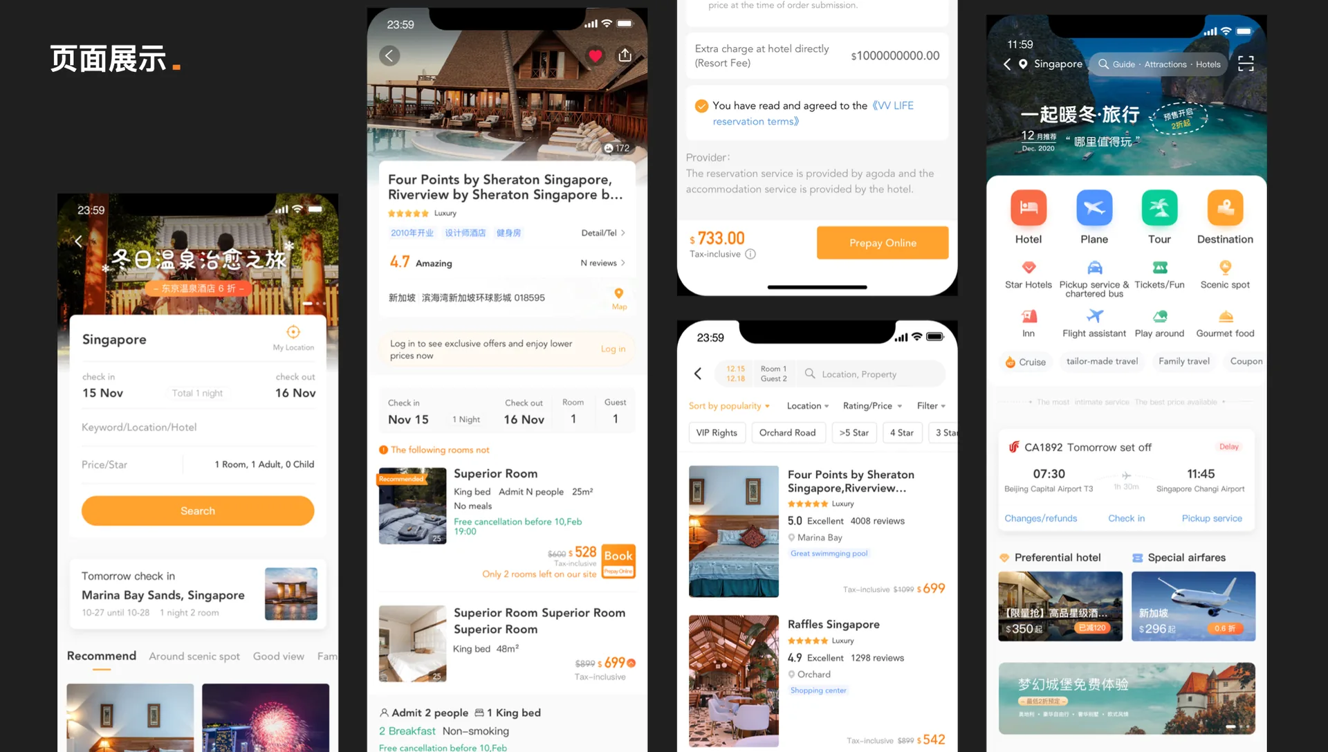
VV Life brings together dining, grocery, reservations, and concierge services in one seamless experience.
 Reservation
 Grocery
 Flights
 Hotels
 Mart
Mart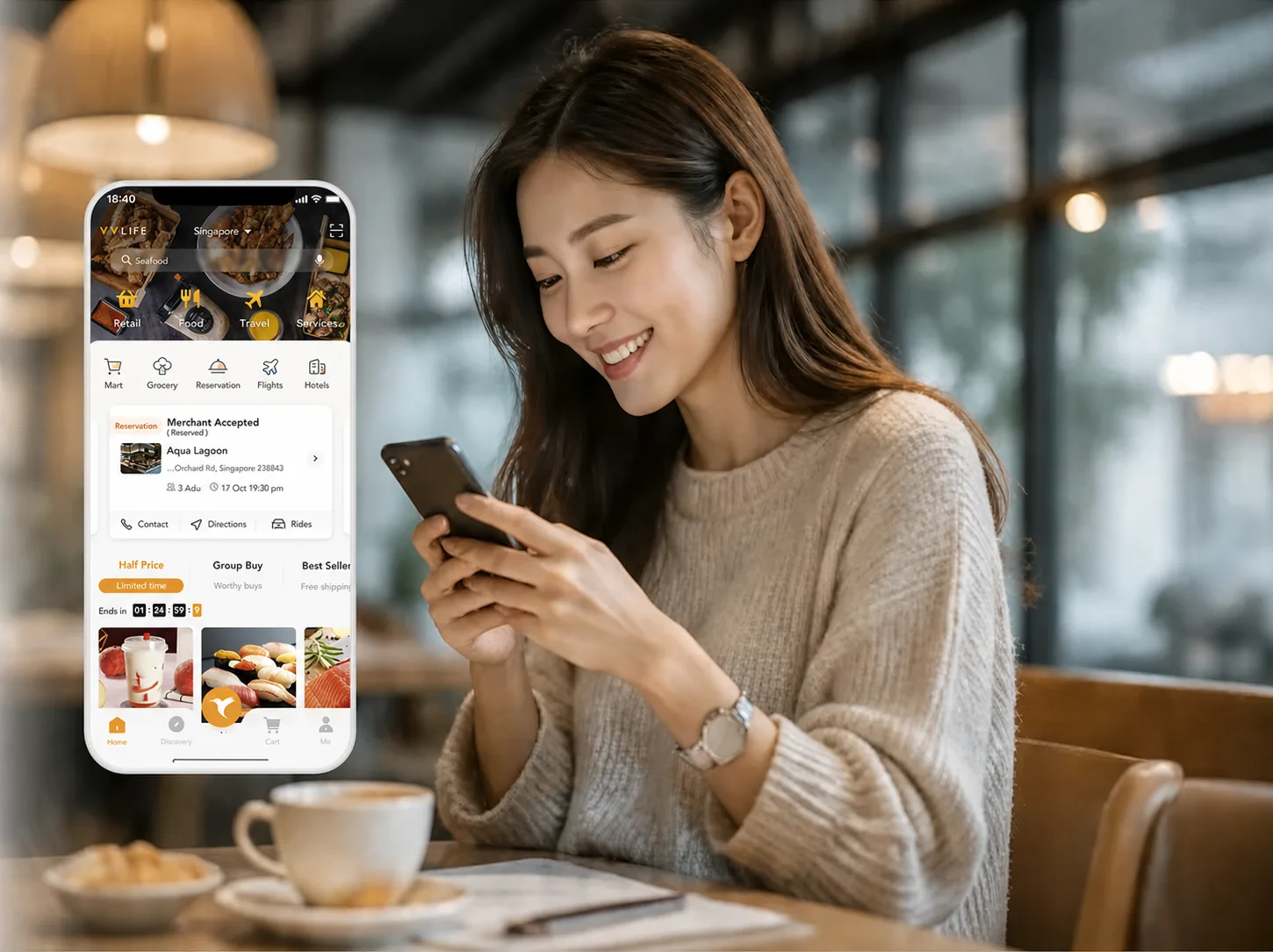
Discover top restaurants, view menus, read reviews, and book your table in seconds.
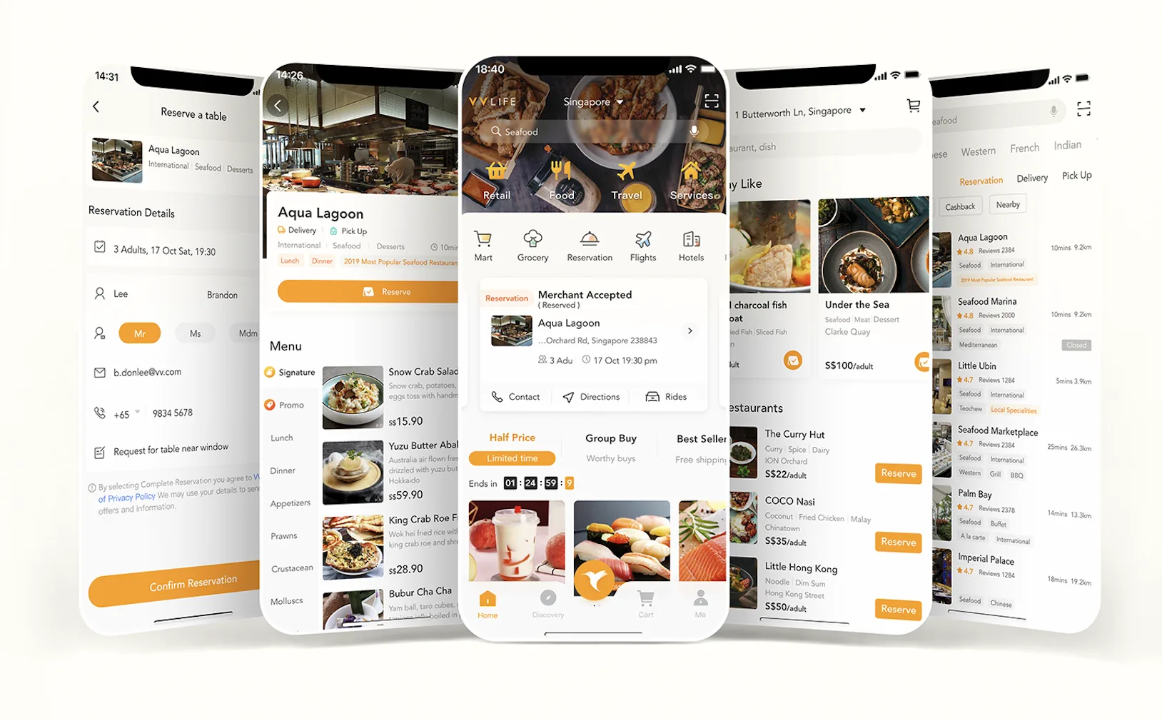
Order groceries, book services, and enjoy exclusive member benefits — all in one app.
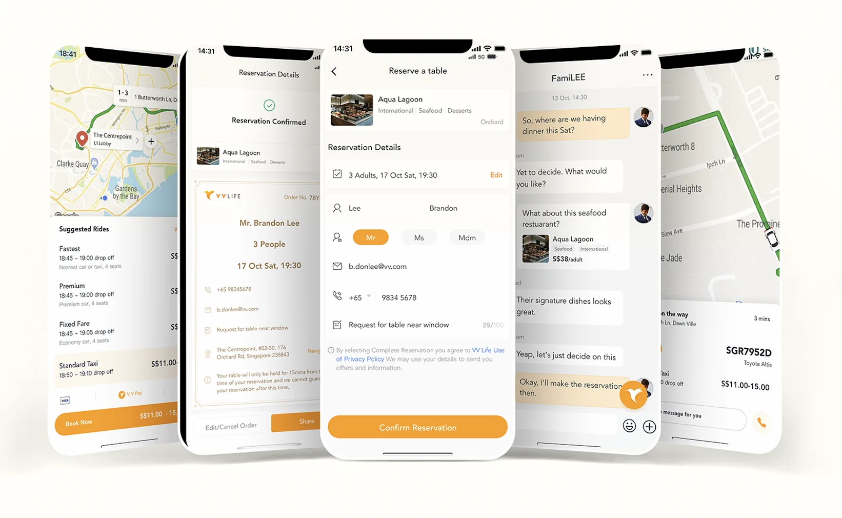
A clean, modern interface that adapts to your lifestyle and makes every interaction delightful.