A Complete Identity System for a Renewable Energy Brand一个面向新能源企业的完整品牌识别系统
A complete corporate identity created for Riching Group, a regional clean-energy company. Rather than designing only a logo, this project establishes a scalable visual system — from symbol construction and typography to colour strategy, layout principles and usage guidelines. The identity was built around a Power Core concept: a controlled source of energy expressed through a dynamic emblem, supported by a six-level colour system and a comprehensive brand guideline designed to keep every application consistent across digital and print.这是为 Riching Group 打造的一套完整企业品牌识别,而不仅仅是一个 Logo。整个项目围绕 Power Core(能量核心) 概念展开,从 Logo 构建、字体规范、品牌色彩、版式系统到 Brand Guideline,建立了一套能够长期扩展、统一品牌形象的视觉体系。
The logo was engineered as a visual metaphor for controlled energy.Logo 并非为了装饰,而是围绕 Power Core 这一品牌概念构建。
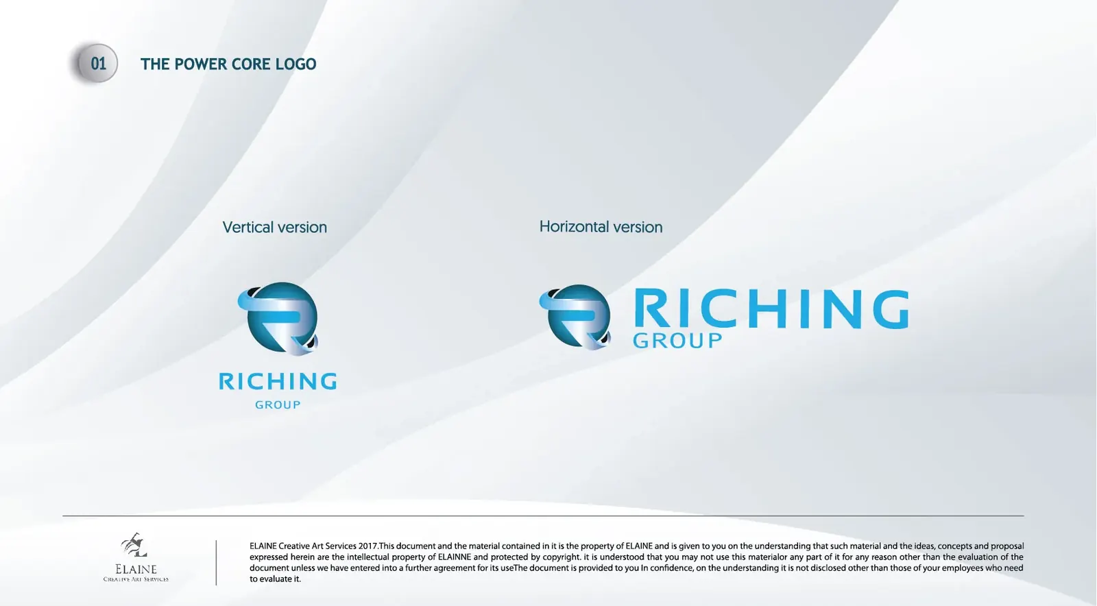
The deep-blue sphere represents the company's energy core, while a metallic ribbon wraps around it to construct the letter R. Two official lockups ensure consistent recognition across websites, reports, presentations and signage.深蓝球体代表能源核心,银色轨迹形成字母 R,利用体积、轨迹与负空间建立稳定、现代且具有科技感的品牌识别。
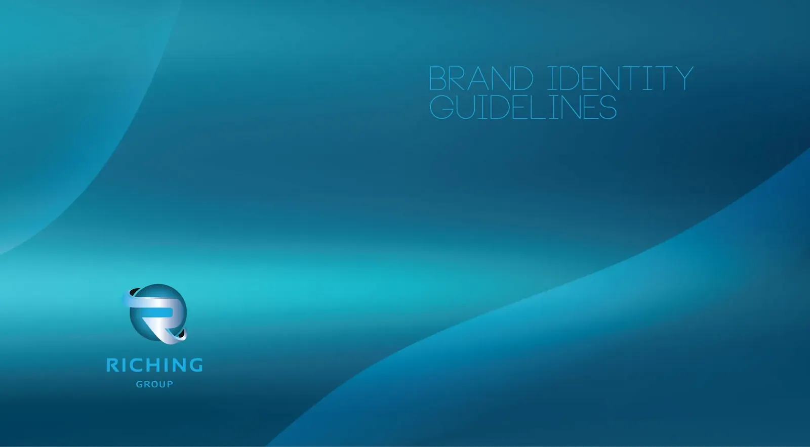

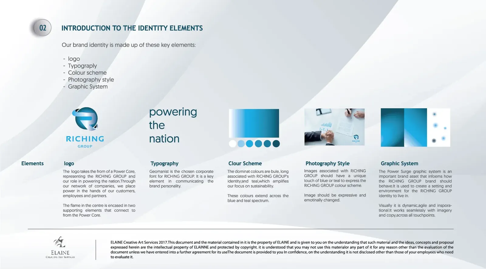
A logo alone cannot create a brand. The identity expands into typography, photography direction, colour hierarchy and supporting graphic elements. Every component follows the same visual rhythm.Logo 只是品牌系统的起点。项目进一步建立品牌字体、摄影风格、辅助图形、品牌色彩及整体版式规范,使所有传播媒介保持统一视觉语言。
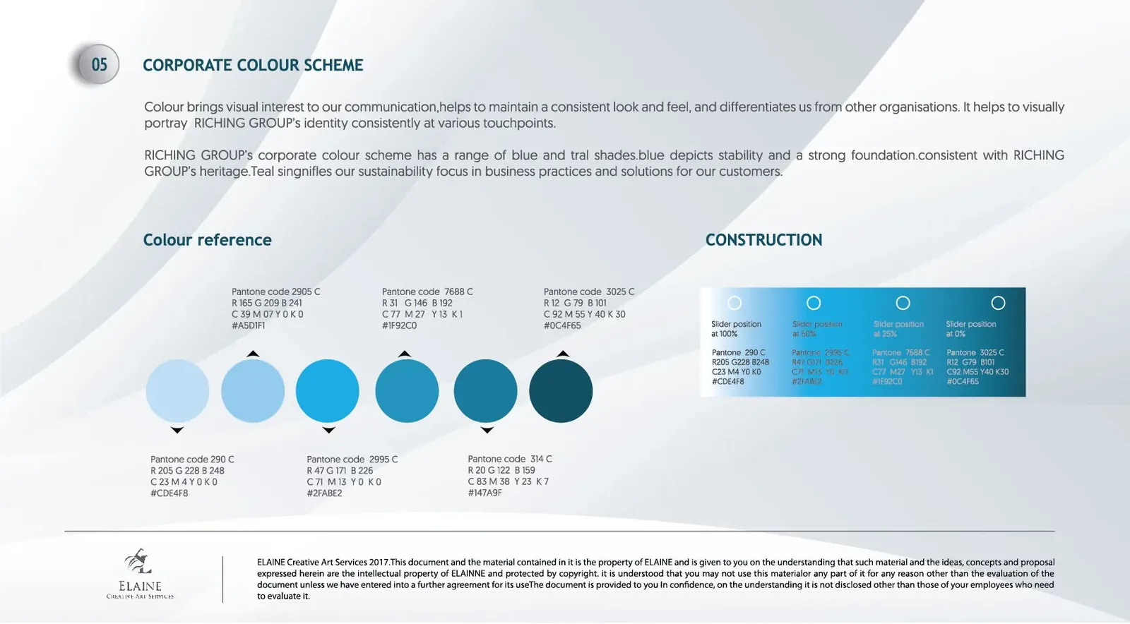
Six carefully balanced blue–teal shades were created with complete Pantone, RGB, CMYK and HEX specifications. Blue communicates trust and stability, while teal represents sustainability and innovation — colour as information, not decoration.建立六阶蓝绿色系统,并制定完整 Pantone、RGB、CMYK、HEX 标准。蓝色代表稳定与信任;青绿色代表新能源、可持续发展与未来科技——色彩不仅代表风格,更承担品牌信息。


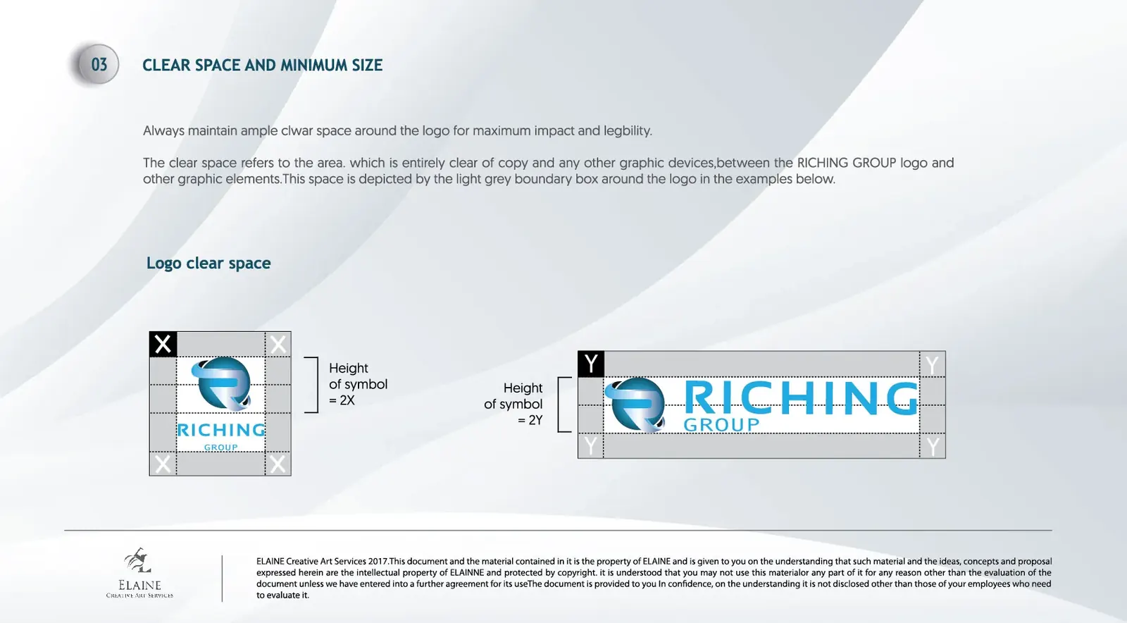
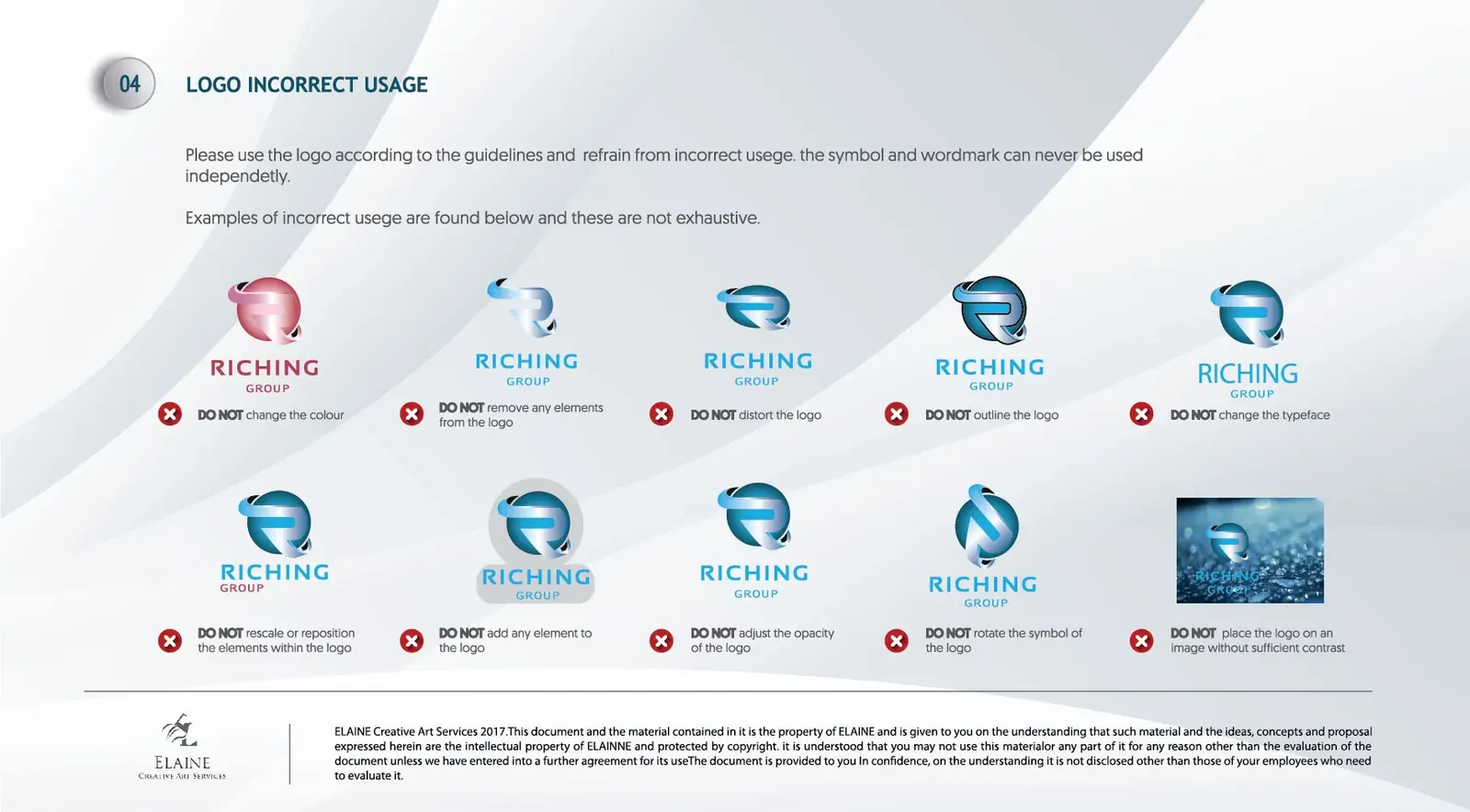
Clear-space rules, minimum sizes and misuse examples were documented so agencies, printers and internal teams can reproduce the identity consistently.通过安全空间、最小尺寸、组合规范及错误示范,将设计经验转化为可执行标准,保证品牌长期保持一致。