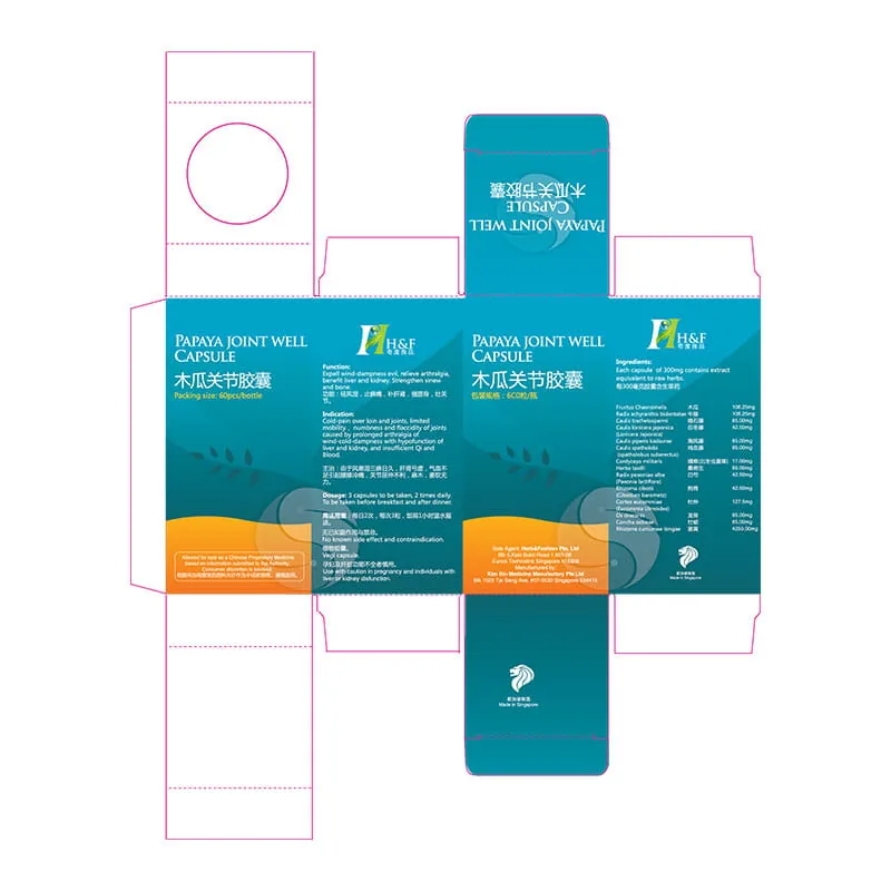
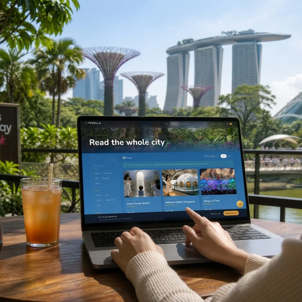
From Bottle to Print-Ready Dieline从瓶身到可付印刀版
Packaging design for herbal and TCM supplements — from bottle label to retail box and production-ready dieline. The objective was to translate the credibility of traditional medicine into a contemporary retail identity that feels premium, systematic and production-ready.为中草药及保健品打造完整包装系统,从瓶身标签、外盒设计到印刷刀模。整个项目旨在将传统中医药的专业可信度,与现代零售品牌体验结合,建立兼顾品牌一致性、产品识别性与量产落地能力的包装体系。
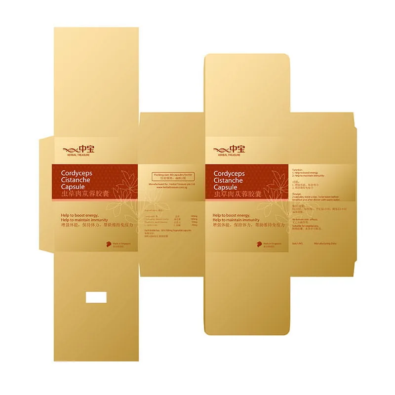
Every SKU follows the same production pipeline: product label, structural box, then print-ready dieline. The work isn't finished at the render — it finishes when manufacturing can reproduce it accurately.每一个 SKU 都遵循同样的设计流程:瓶身 → 外盒 → 刀模。设计不仅追求视觉效果,更确保能够直接进入生产与印刷。
Structure, typography and hierarchy remain consistent while colour becomes the differentiator between products. This allows every SKU to feel unique without sacrificing brand consistency.统一包装结构、版式与字体系统,仅透过色彩区分不同产品,使品牌保持一致,同时提升货架辨识度。
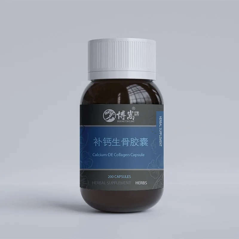
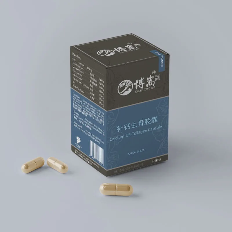
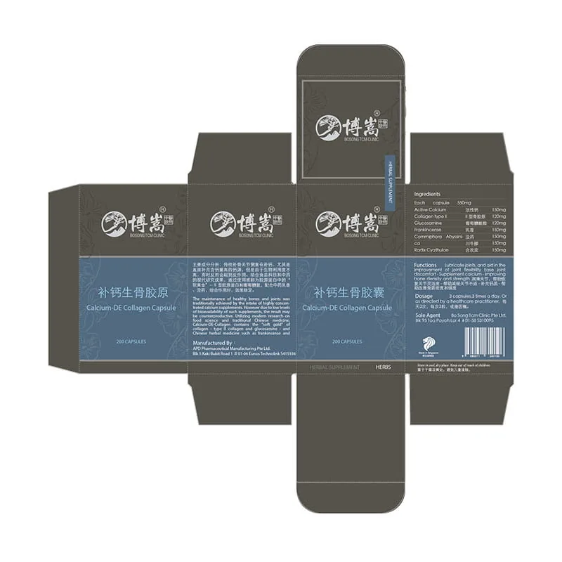
Bone & joint support led by a steady, clinical blue — the most trust-forward accent of the family.以沉稳、临床感的蓝色引领骨骼与关节支持——家族中最强调信任感的一个点缀色。
Blue accent
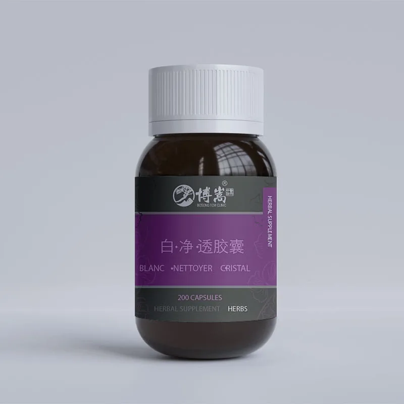
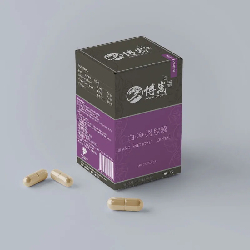
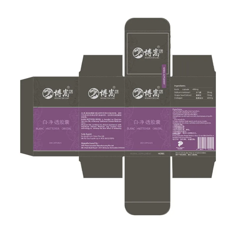
A beauty-from-within SKU in violet — softer and more elegant, aimed at radiance and clarity.主打"由内而外"之美的紫色单品——更柔和、更优雅,指向白皙与通透。
Violet accent
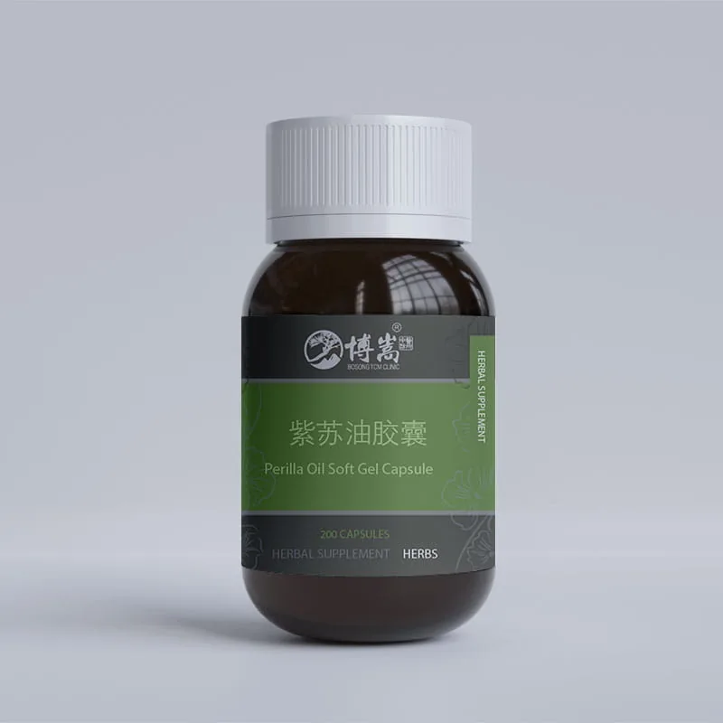
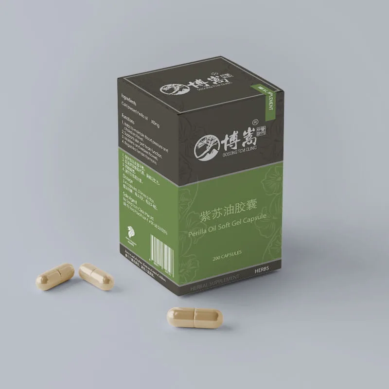
Botanical green for the perilla seed oil soft gel — the most natural, plant-forward voice of the three.紫苏籽油软胶囊使用植物绿——三者中最天然、最"草本"的声音。
Green accent
The same design methodology scales across Bosong, Herbal Treasure and H&F, adapting each brand's personality while maintaining production efficiency and visual quality.设计方法延伸至多个品牌,包括博嵩、中宝及 H&F。不同品牌拥有不同视觉语言,但共享同一套系统化包装设计流程。
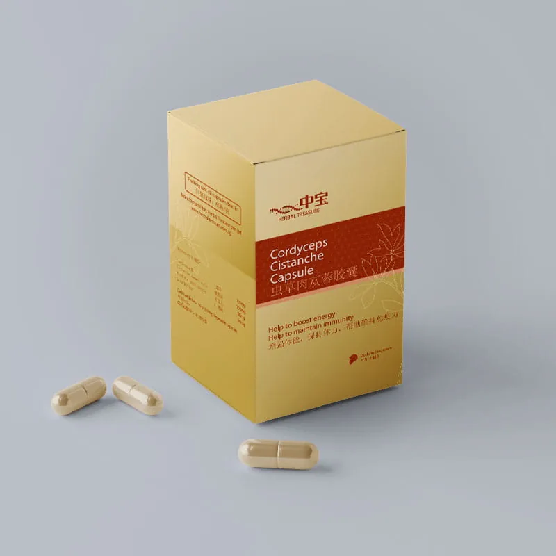
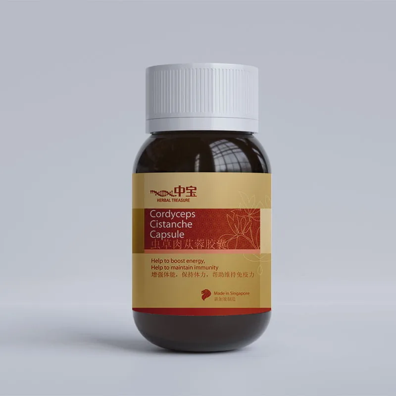
Gold, deep red and cream give the 中宝 flagship an energy-and-immunity heritage feel — boost energy, maintain immunity — badged "Made in Singapore."金、深红与米色为中宝主打款注入"体能 + 免疫"的传承感——增强体能、保持体力、维持免疫力——并标注"新加坡制造"。
Heritage red · gold


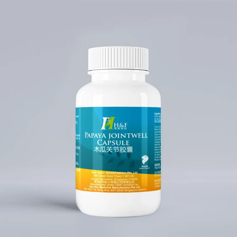
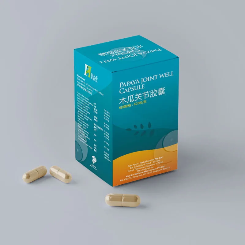
H&F shifts cooler — teal-blue over a warm orange base — for a fresher joint-health read: maintain immunity, renew endurance, antioxidant.H&F 转向更清爽的配色——青蓝压在暖橙底上——传达关节健康的新鲜感:维持免疫、迅速恢复体力、抗氧化。
Teal · orange


Colour-coded SKUs, engineered dielines and bilingual packaging work together as one repeatable packaging framework, making future product expansion straightforward.通过 SKU 色彩系统、标准刀模与中英双语包装规范,建立一套可持续扩展的包装体系,方便未来快速推出新产品。
One accent per product carries the difference, while structure, type and logo stay constant across the family.每款一个点缀色承载区分,结构、字体与标识在家族内保持不变。
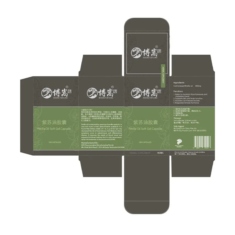
Every box ships as a flattened, print-ready dieline — the design proven all the way to production, not just the render.每个盒子都以展平、可付印的刀版交付——设计一路验证到生产,而不止于效果图。
English and 中文 sit together on every face, built for a Singapore shelf and its regulatory copy.英文与中文同处每一个面,为新加坡货架及其法规文案而设计。