Translating Brand Strategy into Distinct Visual Identities把品牌策略,译成各自分明的视觉识别
This collection brings together 18 custom identity projects across more than 10 industries, demonstrating how different business goals can be translated into concise and memorable visual systems. Rather than applying one signature style to every client, I developed each mark from the brand's positioning, audience, tone and practical application needs. The work ranges from dimensional letterforms and experimental typography to multilingual lockups, commercial emblems and flexible colour systems.本系列集合了 18 个定制品牌标识项目,覆盖 10 个以上行业,展示如何将不同企业定位、受众与商业目标转化为简洁且具有记忆点的视觉系统。设计并不是将同一种个人风格复制给所有客户,而是从品牌定位、目标用户、语气与实际应用需求出发,为每个品牌建立独立的视觉表达。作品涵盖立体字母、实验性字体、多语言组合、商业徽章及灵活配色系统。
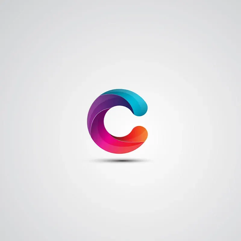
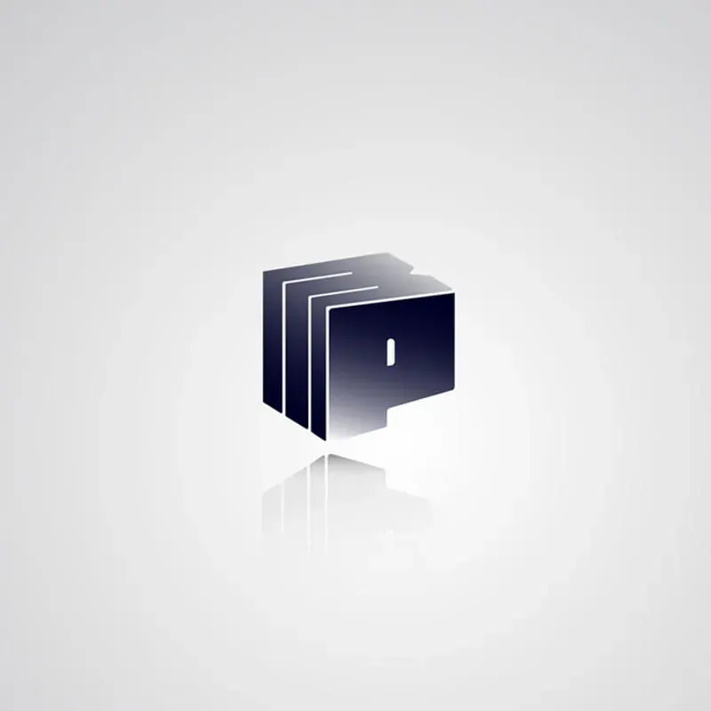
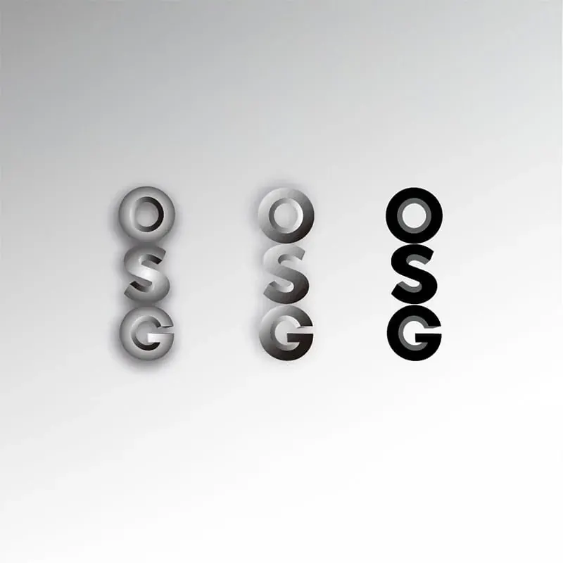
Several concepts explore letters as dimensional objects rather than flat symbols. Form, lighting, material and negative space were used to make each initial feel physically constructed and visually distinctive.部分项目将字母视为具有体积与材质的物体,而不是普通平面符号。通过结构、光影、材质与负空间,让每个首字母拥有明确的造型逻辑与独立个性。
The design challenge was to preserve recognition at small sizes while creating enough depth and personality for digital campaigns, presentation decks and premium brand applications. Every mark was refined to balance visual presence with functional clarity.设计重点是在小尺寸下保持识别度,同时为数字宣传、品牌提案及高端应用提供足够的视觉表现力。每个标识都在视觉存在感与功能清晰度之间进行反复调整。


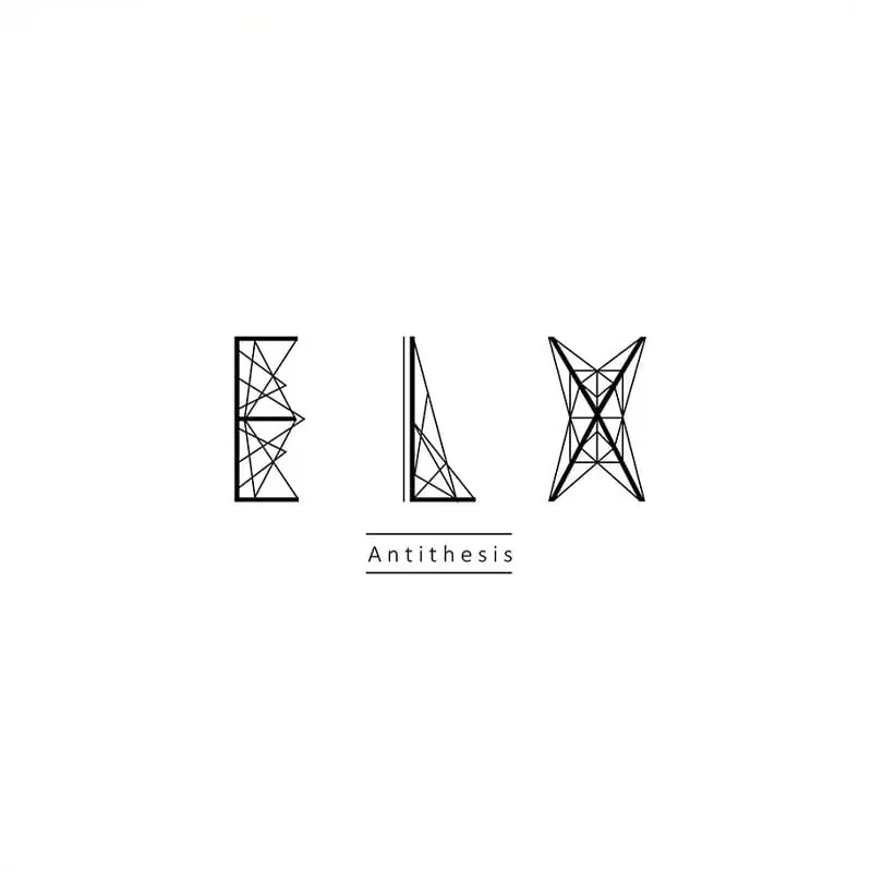
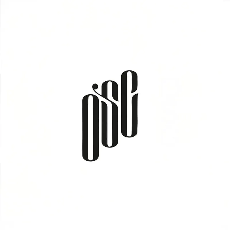
Typography-led identities remove decorative support and rely entirely on proportion, rhythm, spacing and construction. This approach requires every curve, joint and alignment decision to communicate the brand's character.纯字体标识没有装饰元素可以依赖,品牌气质完全由比例、节奏、字距与结构决定,因此每一个转角、连接与对齐都需要承担表达功能。
Across condensed wordmarks, geometric structures and custom ligatures, I developed letterforms that remain ownable without sacrificing readability. The result is identity work that can operate confidently in monochrome, small-scale and production-sensitive environments.通过超窄字体、几何结构与定制连字,我建立了既具有独特性又保持可读性的字形系统,使标识在黑白、小尺寸及不同生产条件下依然稳定有效。
Each identity moved through concept exploration, silhouette testing, typography refinement, colour development and application checks. Marks were evaluated in monochrome, reduced scale and alternate backgrounds before final delivery.每个品牌标识都经历概念探索、轮廓测试、字体细化、配色开发及应用验证,并在黑白、小尺寸与不同背景中检查稳定性。


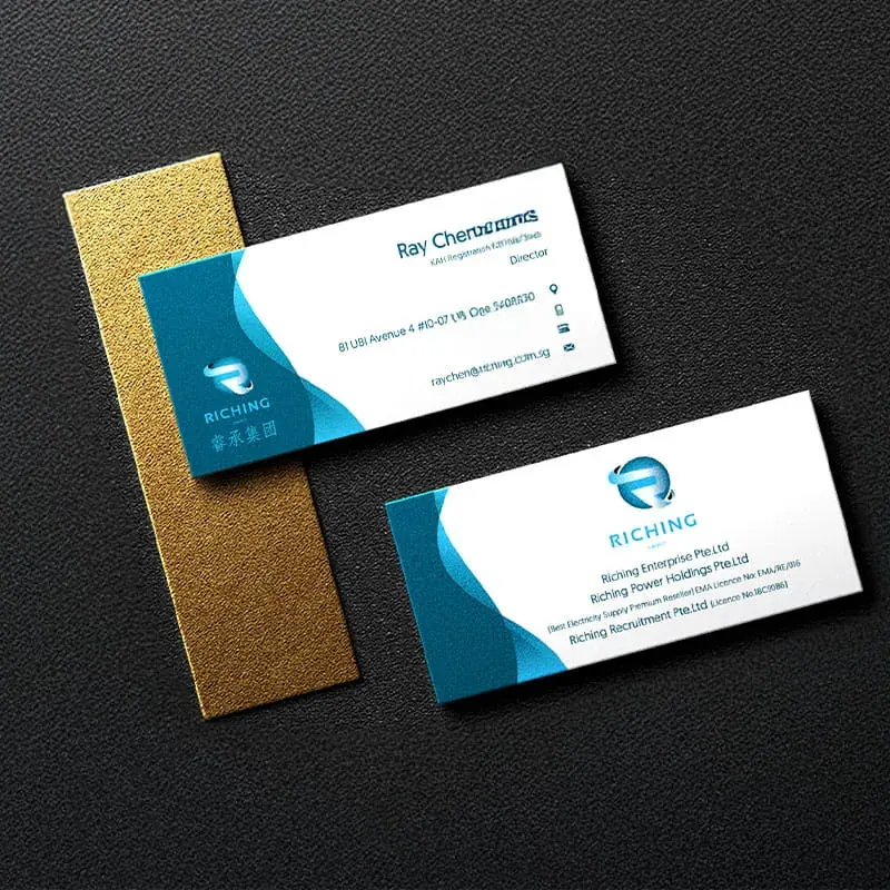
A logo becomes valuable when it can adapt across real applications. Several projects therefore included primary and secondary lockups, bilingual versions, colour variants and different levels of visual emphasis.Logo 的价值来自真实应用中的适应能力,因此多个项目同时设计了主副组合、双语版本、不同配色及多种视觉层级。
I treated the logo as the starting point of a broader identity system, defining how it should respond to changing formats, languages and brand hierarchies. This ensured consistency across websites, print, social media, packaging and internal communication.我将 Logo 视为完整品牌系统的起点,明确其在不同尺寸、语言与品牌层级中的使用方式,从而保证网站、印刷、社交媒体、包装与内部沟通中的一致性。
Final packages were prepared as practical brand assets rather than presentation-only artwork, including vector masters, colour specifications, lockups and export formats suitable for both digital and print use.最终交付不仅是展示效果图,而是可直接使用的品牌资产,包括矢量源文件、颜色规范、组合版本及适用于数字与印刷的输出格式。


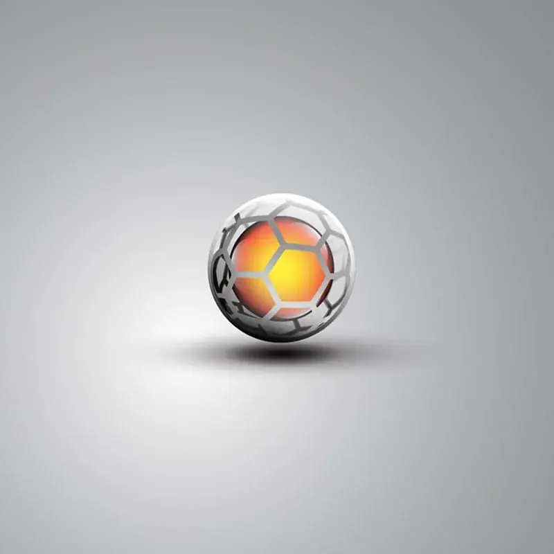
The collection spans finance, beauty, logistics, entertainment, sports, networking and consumer services. Each category requires a different balance of authority, warmth, energy, sophistication or playfulness.项目横跨金融、美容、物流、娱乐、运动、商业社群及消费服务等不同领域,每个行业对权威感、亲和力、活力、高级感与趣味性的要求都不同。
My process identifies the most distinctive brand idea and compresses it into a simple visual device: a running-track monogram, a beauty profile integrated into a letter, a parcel with a playful silhouette, or a premium emblem built around value and trust.我的设计方法是先找出品牌最独特的核心概念,再将其压缩为简洁的视觉装置,例如跑道构成的字母、人物侧脸融入字形、具有趣味轮廓的包裹,或强调价值与信任的高级徽章。